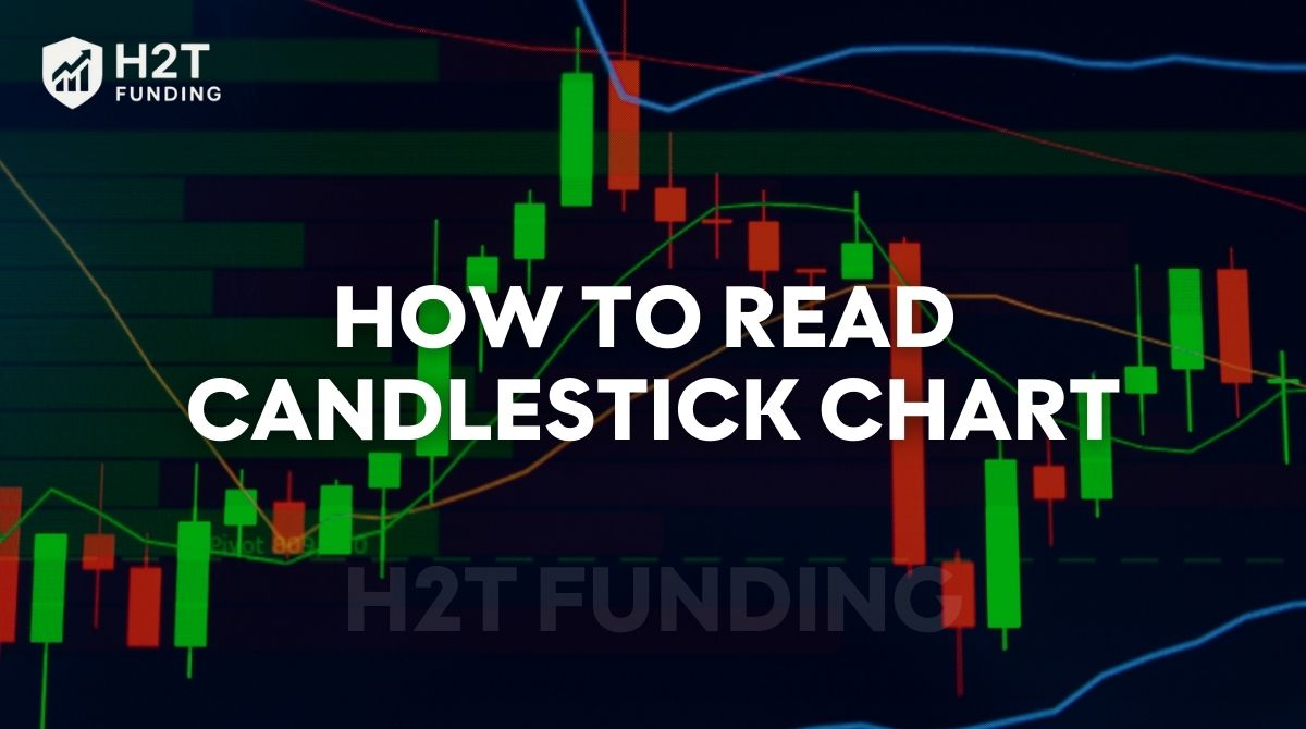
For a new trader, looking at a financial chart is often just noise. A screen full of red and green bars can feel random, pushing you to make trades based on guesses, a recipe for frustration.
This guide is built to change that. H2T Funding will show you how to read candlestick charts by breaking down every component into simple, easy-to-understand parts, from a single candle’s anatomy to powerful chart patterns.
Our goal is simple: to give you the skill to look at any chart, understand the story behind the price action, and start making trades based on clear analysis, not just hope.
Key takeaways
- Candlestick charts visualize market psychology by showing the battle between buyers and sellers through four price points: open, high, low, and close.
- A candlestick’s body, shadows, and color together reveal momentum, volatility, and direction, essential context for price action reading.
- The most reliable chart reading method follows a simple routine: identify trend -> analyze recent candles -> look for patterns at key support/resistance levels.
- Reversal patterns (Hammer, Engulfing, Morning/Evening Star) and continuation patterns (Doji, Spinning Top, Rising/Falling Three Methods) help traders anticipate potential market shifts.
- Candlestick patterns are only meaningful when combined with context, volume, confirmation, and key levels; a single isolated candle is never a signal by itself.
1. What is a candlestick chart?
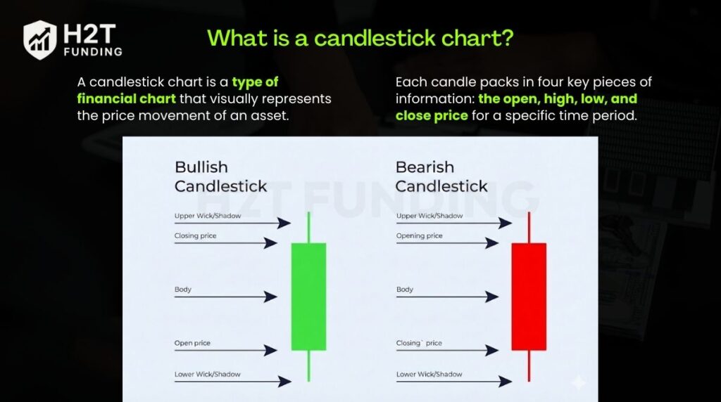
A candlestick chart is a type of financial chart that visually represents the price movement of an asset. To understand how to read a candlestick graph accurately, note that each candle packs in four key pieces of information: the open, high, low, and close price for a specific time period.
Its origins trace back to 18th-century Japan, where rice merchants first developed it. The Japanese candlestick chart was revolutionary. It didn’t just track price; it also visualized market emotions and the struggle between buyers and sellers.
That same principle is why traders rely on it today. Whether trading independently or through a prop firm, the chart provides an instant snapshot of market momentum, making it a cornerstone of technical analysis for spotting potential trends and reversals.
2. The components of a candlestick
Every single candlestick you see is built the same way, whether it represents one minute or one day. Learning how to read a candle chart is like learning the alphabet before you read a book. Let’s break down its three core parts.
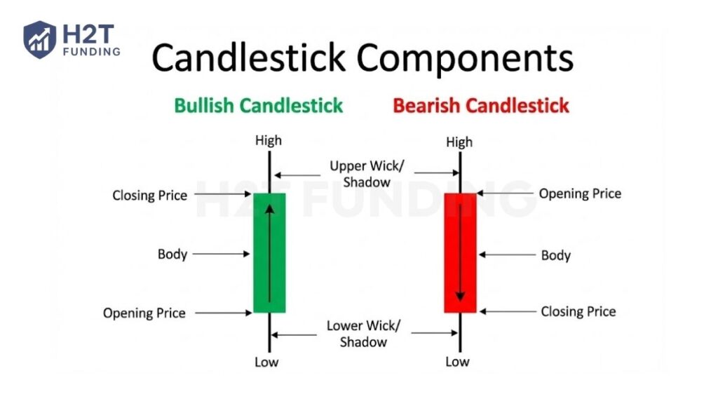
2.1. The real body (open and close)
The body is the wide, rectangular part of the candlestick. It represents the range between the open and close prices for that session. A long body indicates strong buying or selling pressure, while a short one suggests little price movement and potential uncertainty.
2.2. The shadows or wicks (high and low)
The lines extending above and below the body are the shadows, also known as wicks. They indicate the high and low price points reached during the trading period. Long wicks can signal significant volatility and show that prices were tested but ultimately rejected at those levels.
2.3. The color (bullish vs. bearish)
On any candle trading chart, the color of the body reveals the direction of the market’s movement.
- A green (or white) body is bullish and indicates a price increase. This means the close was higher than the open.
- A red (or black) body is bearish and shows a price decrease. This means the close was lower than the open.
Together, these three parts: the real body, the wicks, and the color, don’t just give you data; they give you context. The body and color show you the main outcome, while the shadows reveal the struggle that happened behind the scenes. Mastering this simple anatomy is the first step in reading the candlestick chart effectively.
When applied correctly, candlestick analysis helps traders control drawdown. It also improves understanding of how leverage amplifies both profits and losses, which is a critical part of effective risk management.
3. How do you read a candlestick chart guide step-by-step
Being able to recognize a single candlestick is only the starting point. Reading a chart properly means following a clear, repeatable process that helps you understand market context, price behavior, and trader psychology. Instead of reacting to random candles, this step-by-step method allows you to build a logical case for each trading decision.
3.1. Step 1: Define the overall market trend
Start by zooming out to a higher timeframe and identifying the general direction of the market. Ask yourself whether the price is making higher highs and higher lows, lower highs and lower lows, or moving sideways.
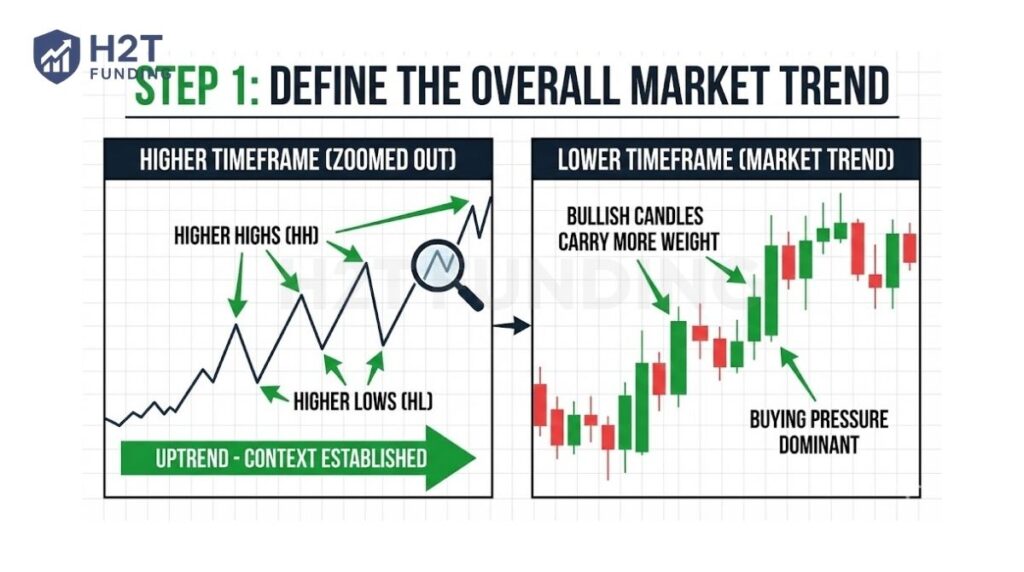
This step provides critical context. In an uptrend, bullish candles and buying pressure tend to follow through more reliably. In a downtrend, bearish candles carry more weight. Without this big-picture view, individual candlesticks can easily be misinterpreted.
3.2. Step 2: Choose the right timeframe for your analysis
Next, confirm which timeframe you are reading. A candlestick represents different levels of market participation depending on its timeframe.
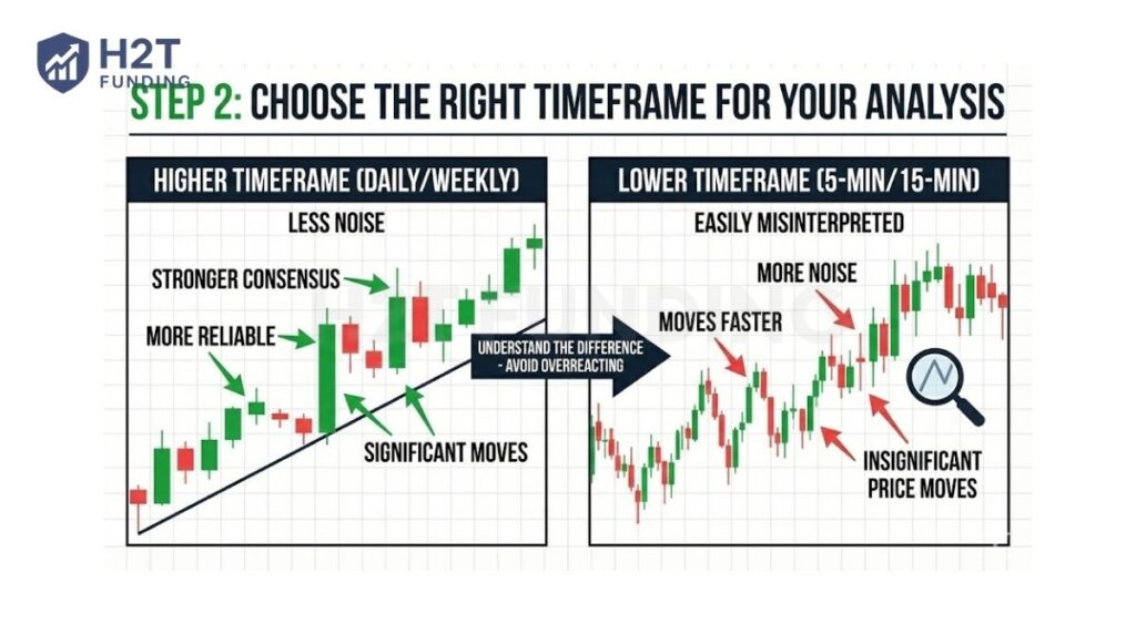
Higher timeframes, such as daily or weekly candles, reflect stronger consensus and are generally more reliable. Lower timeframes like 5-minute or 15-minute candles move faster but contain more noise. Understanding this difference prevents you from overreacting to insignificant price moves.
3.3. Step 3: Read the candle body to assess buying or selling pressure
Once the context is clear, focus on the candle body. A bullish candle forms when the close is higher than the open, showing that buyers controlled the session. A bearish candle forms when the close is lower than the open, indicating seller dominance.
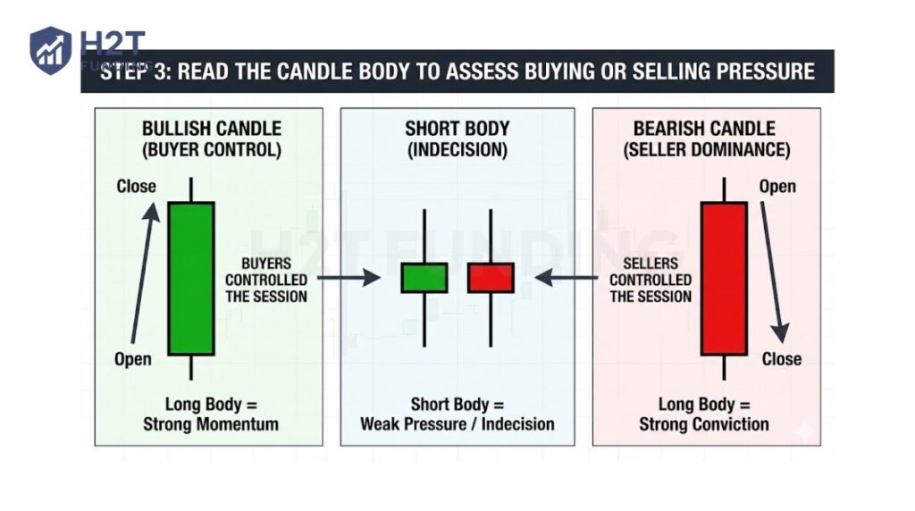
The length of the body matters. Long bodies signal strong conviction and momentum, while short bodies suggest weak pressure or indecision.
3.4. Step 4: Analyze the wicks to spot rejection and volatility
After evaluating the body, look at the wicks. Long upper wicks indicate that the price was pushed higher but rejected, suggesting selling pressure above. Long lower wicks show buyers stepping in after a decline, signaling demand.
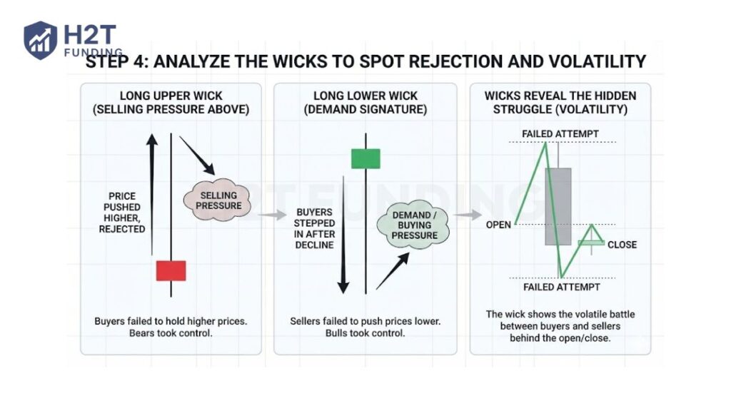
Wicks help you see the hidden struggle behind the open and close, revealing volatility and failed attempts to move the price further.
3.5. Step 5: Evaluate recent price action, not just one candle
Avoid focusing on a single candlestick in isolation. Instead, observe how the last few candles interact with each other. Are bodies getting larger, showing increasing momentum? Are wicks becoming longer, hinting at exhaustion or hesitation?
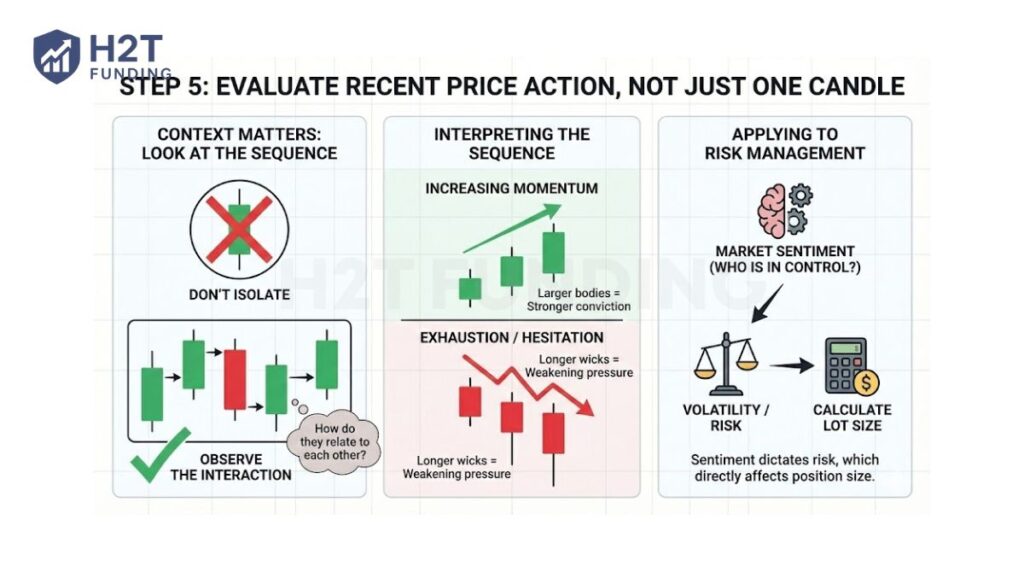
Recent price action gives insight into current market sentiment and who is gaining control. This step is also essential before deciding position size, since market volatility directly affects risk and how you calculate lot size.
3.6. Step 6: Look for candlestick signals at key levels
Candlestick signals are most meaningful at important price areas such as support and resistance. A bullish candle near support or a bearish candle near resistance often carries more significance than the same candle forming in the middle of a range.
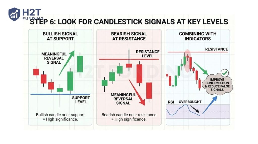
At this stage, many traders combine candlestick signals with indicators to improve confirmation and reduce false signals.
3.7. Step 7: Align the signal with the broader market story
Finally, combine everything. Check whether the candlestick signal aligns with the overall trend, the chosen timeframe, and recent price behavior. When multiple elements point in the same direction, the signal becomes stronger and more reliable.
Read more:
4. Common candlestick patterns every trader should know
Once you can read a single candlestick, you can move on to the core of the candlestick trading: spotting patterns. These are specific shapes made from one or more candles that can hint at where a trend might go. You do not need to know all of them. Focusing on these core patterns gives you a solid base for your technical analysis.
4.1. Bullish reversal patterns
These patterns show up after a price has been falling. They are clues that sellers might be exhausted and that a price movement to the upside could be coming.
4.1.1. The Hammer & Inverted Hammer
The Hammer candlestick pattern is formed of a short real body with a long lower shadow. It is found at the bottom of a downward trend. The long shadow shows that although sellers pushed the price to a new low, a strong buying pressure ultimately drove the price back up.
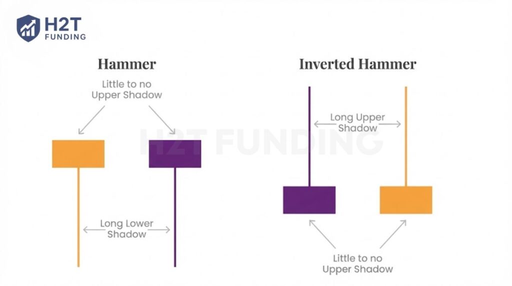
The Inverted Hammer also signals a potential bullish reversal. It shows that buyers showed up, but could not hold the gains. Crucially, the sellers were too weak to push the price any lower. You need to see a strong bullish candle the next day for confirmation.
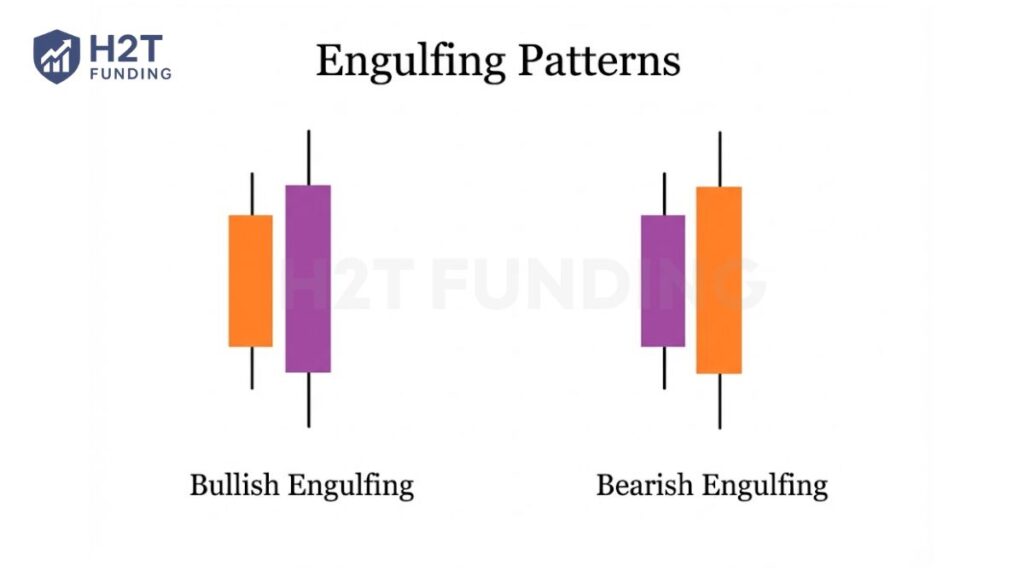
4.1.2. The Bullish Engulfing Pattern
The Bullish Engulfing pattern is formed of two candlesticks. The first candlestick is a short bearish body that is completely engulfed by a larger bullish candlestick. Though the second day may open lower than the first, the bullish market pushes the price up, resulting in an obvious win for buyers and a strong reversal signal.
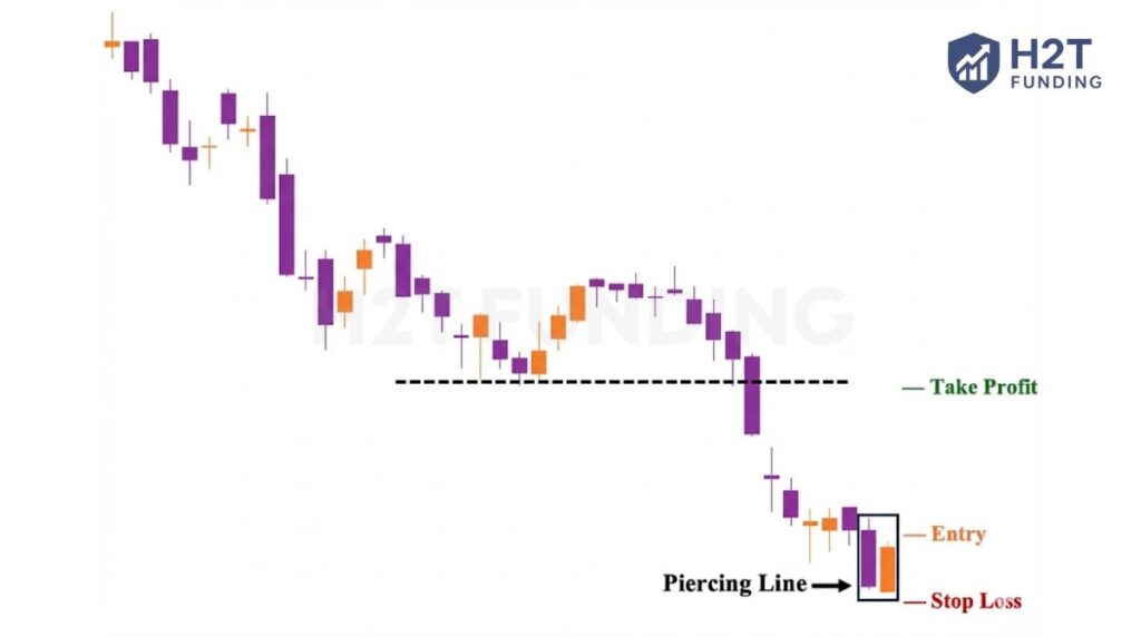
4.1.3. Piercing Line
The Piercing Line is a two-candlestick pattern with a long bearish candle followed by a long bullish candle. It typically forms with a clear gap between the first close and the second open. This pattern signals strong buying pressure as the price drives up toward or above the previous day’s midpoint.
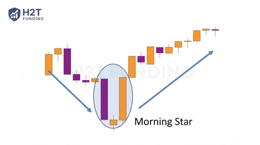
4.1.4. The Morning Star
The Morning Star signals renewed strength after a decline. This three-bar reversal pattern features a strong bearish bar, a small indecision bar such as a Doji, and a powerful bullish bar to finish. Together, they reveal the market forming a bottom before buyers step in decisively.
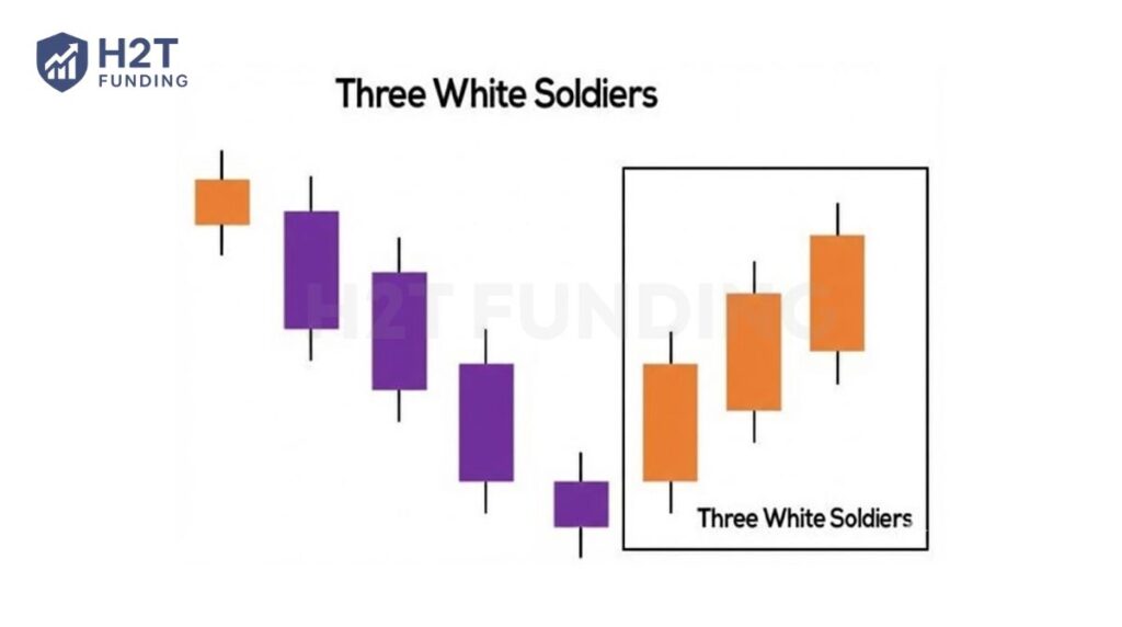
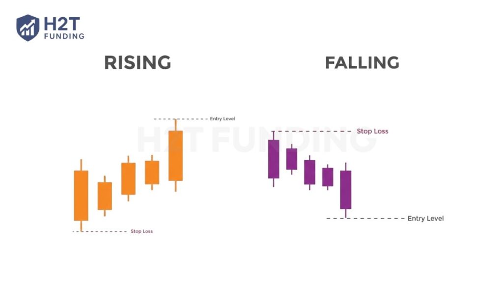
4.1.5. The Three White Soldiers
The Three White Soldiers pattern occurs over three days. It consists of consecutive long bullish candles with small wicks, which open and close progressively higher than the previous day. It is a very strong bullish signal that occurs after a downtrend and shows a steady advance amid buying pressure.
4.2. Bearish reversal patterns
These bearish candlestick patterns typically form after an uptrend and signal a point of resistance. Heavy pessimism about the market price often causes traders to close their long positions and open short positions to take advantage of the falling price movement.
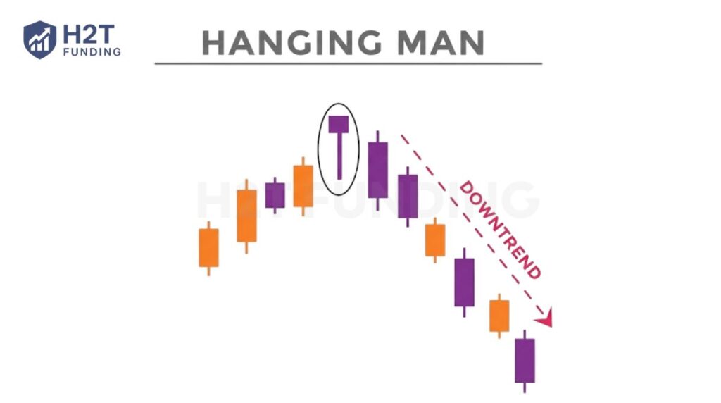
4.2.1. The Hanging Man
The Hanging Man is the bearish equivalent of the bullish reversal pattern. It has the same shape but forms at the end of an uptrend. It indicates that there was a significant sell-off during the day, but that buyers were able to push the price up again. This large sell-off is often seen as an indication that the bulls are losing control.
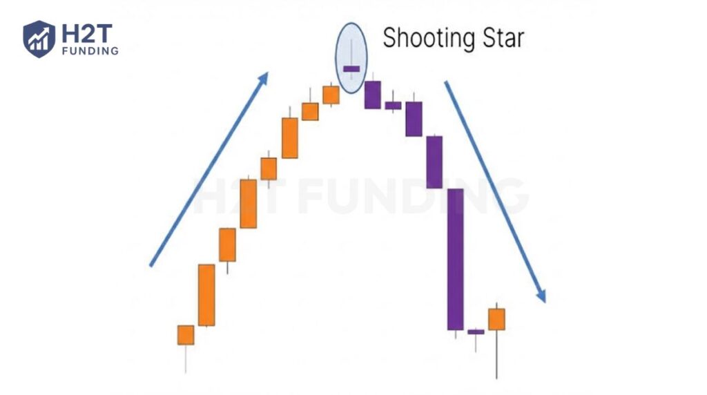
4.2.2. The Shooting Star
The Shooting Star is the same shape as the inverted hammer, but is formed in an uptrend. It has a small lower body and a long upper body. Usually, the market will gap slightly higher on opening and rally to an intra-day high before closing at a price just above the open.
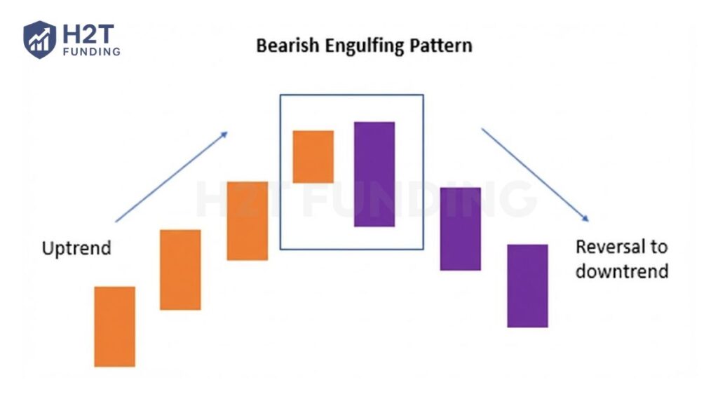
4.2.3. The Bearish Engulfing Pattern
A Bearish Engulfing pattern occurs at the end of an uptrend. The first candlestick has a small bullish body that is engulfed by a subsequent long bearish candlestick. It signifies a peak or slowdown of price action and is a sign of an impending market downturn. The lower the second candle goes, the more significant the trend reversal is likely to be.
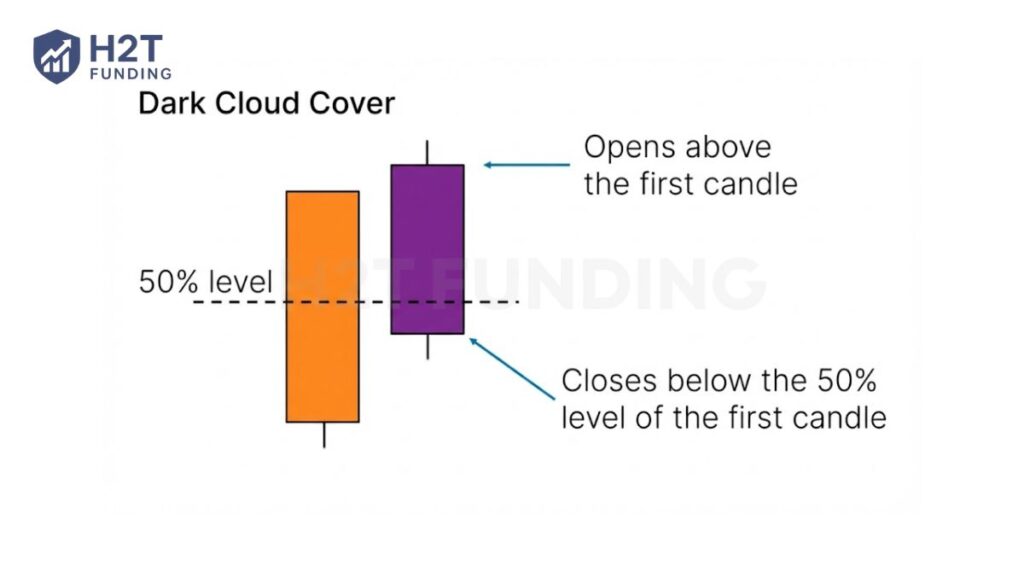
4.2.4. Dark Cloud Cover
The Dark Cloud Cover candlestick pattern indicates a bearish reversal. It comprises two candlesticks: a bearish candlestick that opens above the previous bullish body and closes below its midpoint. It signals that the bears have taken over the session, pushing the price sharply lower.
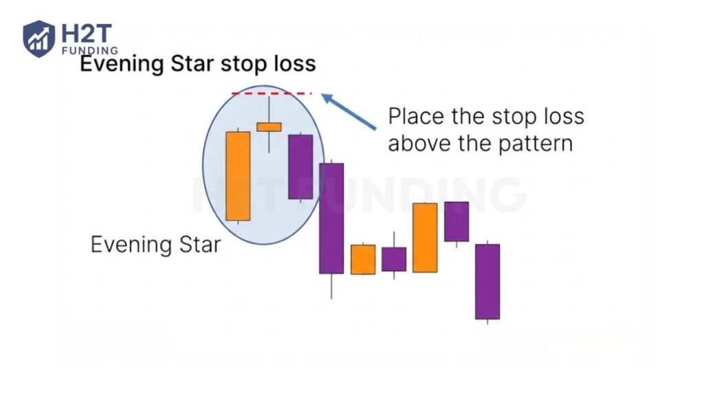
4.2.5. The Evening Star
The Evening Star is a three-bar formation that mirrors the bullish Morning Star. It features a small bar positioned between a strong bullish bar and a strong bearish one. This structure signals an uptrend losing momentum, and the pattern becomes more convincing when the final bar wipes out most of the initial advance.
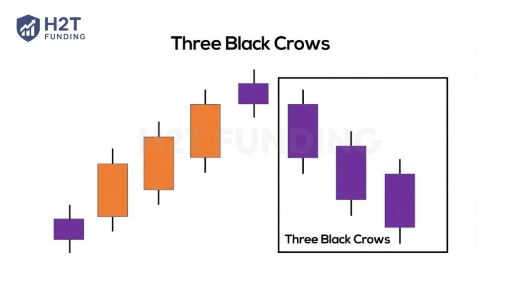
4.2.6. The Three Black Crows
The Three Black Crows candlestick pattern comprises three consecutive long bearish candles with short or non-existent shadows. Each session opens at a similar price to the previous day, but selling pressures push the price lower with each close. Traders interpret this pattern as the start of a bearish downtrend.
4.3. Continuation and indecision patterns
Sometimes the market is not reversing; it is just taking a breath. These patterns signal that the current trend has entered a period of consolidation, or that neither buyers nor sellers are in control of the price movement.
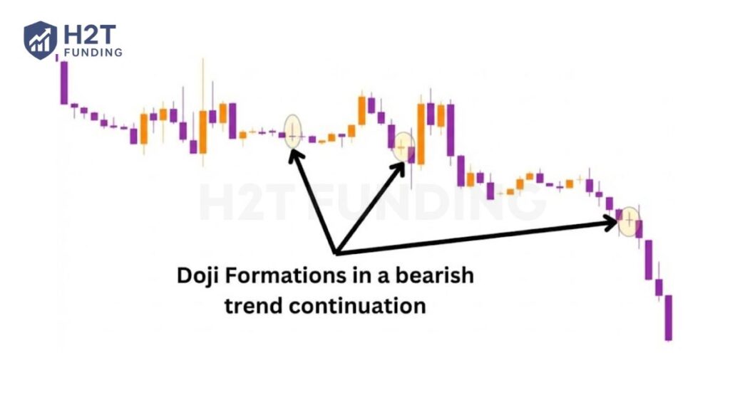
4.3.1. The Doji (signifying indecision)
A Doji is the ultimate picture of indecision. It forms when the open and close prices are almost identical, creating a candlestick that looks like a plus sign. It shows a perfect stalemate between bulls and bears. On its own, a Doji means the previous momentum has completely stalled.
4.3.2. The Spinning Top
A Spinning Top also signals indecision, but with more volatility than a Doji. It has a short real body and long upper and lower shadows. This tells you the price went on a big round trip, but ended up almost exactly where it started. It often marks a period of consolidation before the next move.
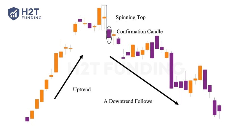
4.3.3. Rising and Falling Three Methods
These five-bar formations show a trend pausing before continuing. In the bearish Falling Three Methods, a strong bearish bar appears first, followed by a cluster of smaller bullish bars that stay within its range. A final bearish bar reasserts downward momentum. The bullish Rising Three Methods works in reverse.
To put it all together, these patterns are your guide to the market’s story. You have a signal that a trend may be ending, both bullish and bearish. Then you have a continuation, and that shows when the market is pausing. Learning to spot these different formations on your chart is how you move from guessing to making informed decisions based on price action.
5. Practical applications for reading candlestick charts
Memorizing patterns is easy. Using them to make money is hard. A single candlestick pattern is not a trading system. Here is how you actually apply this knowledge in a way that makes sense.
5.1. Combining patterns with support and resistance
This is the most important rule I can give you. Where a pattern happens on the chart matters more than what the pattern is. Most patterns that show up in the middle of a price range are just random noise.
However, when a pattern forms at a major support or resistance zone, it becomes a high-probability signal worth attention. For example, a Hammer candle by itself may look interesting, but a Hammer reacting directly off a key daily support level carries far more meaning.
This principle is a core part of any trading strategy for beginners, because it teaches you to focus on context instead of chasing every pattern you see.
5.2. Using confirmation to avoid false signals
Seeing a perfect reversal pattern can make you want to jump into a trade right away. Do not do it. A pattern is a clue, not a guarantee. You should always wait for the market to give you confirmation.
So, what is confirmation? If you spot a bullish engulfing candlestick, wait for the next candle to actually move higher. If it does, your bullish idea is confirmed. If it immediately turns around and goes lower, the signal was fake. Developing the habit of waiting for confirmation is one of the most effective ways to become more disciplined in your trading.
5.3. Analyzing patterns across different timeframes
A candlestick pattern on a five-minute chart is not as important as one on a daily chart. You need to check multiple timeframes to see the whole story. I always begin my technical analysis on a higher timeframe, like the daily, to see the main trend and find the major support and resistance zones.
Only then do I zoom in to a lower timeframe, like the one-hour chart, to find a specific entry signal. A bearish pattern on the one-hour chart is much more reliable if the daily chart is already in a clear downtrend. This way, you make sure you are trading with the market’s main force, not fighting it.
6. Common mistakes to avoid when reading charts
When looking at a full candlestick chart, how to read it with discipline instead of just spotting patterns can feel like unlocking a superpower. The immediate temptation is to see them everywhere and trade every single one. But this is exactly where many new traders get into trouble. Success is not just about what you do, but also about what you don’t do.
Here are the most common mistakes I see, and how you can avoid them.
- Relying on a single candlestick or isolated pattern without context: A bullish candle means little if the overall market is trending down. Always consider the broader trend, recent structure, and where the pattern appears. Candlesticks should never be read in isolation.
- Ignoring confirmation from volume, trend, support, resistance, and timeframe: Candlestick signals are stronger when supported by volume and aligned with the main trend. Patterns that form against a higher-timeframe direction or on weak volume often turn into false signals.
- Overtrading by taking every pattern you see: Not every candlestick setup is worth trading. Patterns that form in the middle of a range are usually noise. Focus on clean setups at key levels and avoid chasing quantity over quality.
- Trading without a clear risk management plan: Before entering a trade, you must know exactly where you will exit if it goes wrong. No candlestick pattern works every time. Risk management is what keeps losses small and accounts alive.
- Expecting 100% accuracy from candlestick patterns: Candlesticks show probability and market psychology, not certainty. Losses are part of trading. Consistency comes from discipline and risk control, not being right on every trade.
These are not just tips; they are rules. You avoid these mistakes by building a solid process. It is about finding a good candlestick pattern at the right location, with the right context, and always knowing your exit strategy before you even think about entering a trade.
7. Experience on how to read a candlestick chart from a real trader on Reddit
Theory is helpful, but hearing from experienced traders offers a different level of insight. We explored discussions on Reddit to see what real traders focus on regarding how to read candlestick graph analysis in real-time.
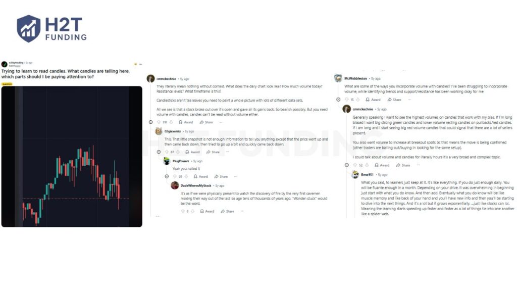
The most common advice is that context is everything. As one user points out, individual candlesticks literally mean nothing without context. Veterans always ask bigger questions first, like where the key support and resistance levels are.
Another experienced trader agrees, stating that price action is only half the story. You need volume to confirm if a candlestick signal has any real strength behind it, as a breakout on low volume is often a trap.
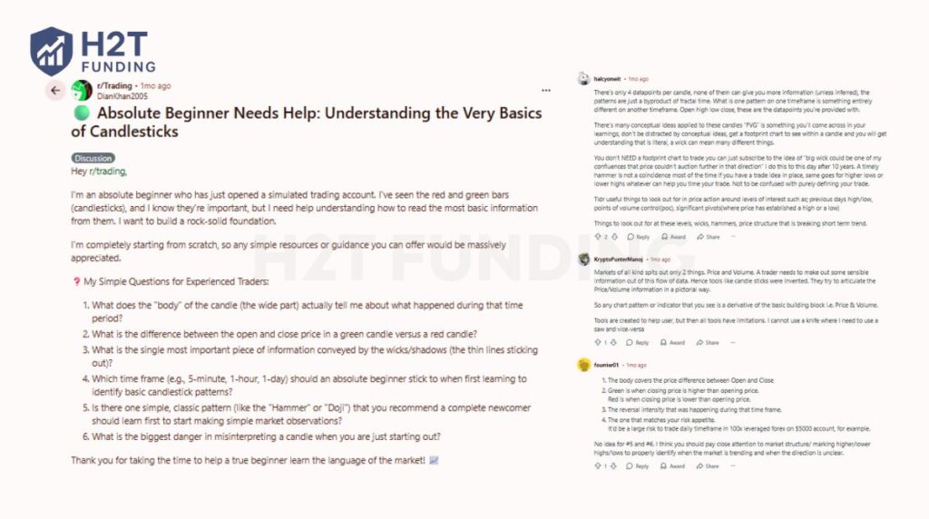
In another thread, a beginner asks for help with the basics. One trader wisely advises them to focus on practical things like previous highs and lows instead of just memorizing patterns.
Another simplifies it perfectly: Markets of all kinds spit out only 2 things. Price and Volume. He explains that candlestick charts were invented to visualize this core information. Everything else is secondary.
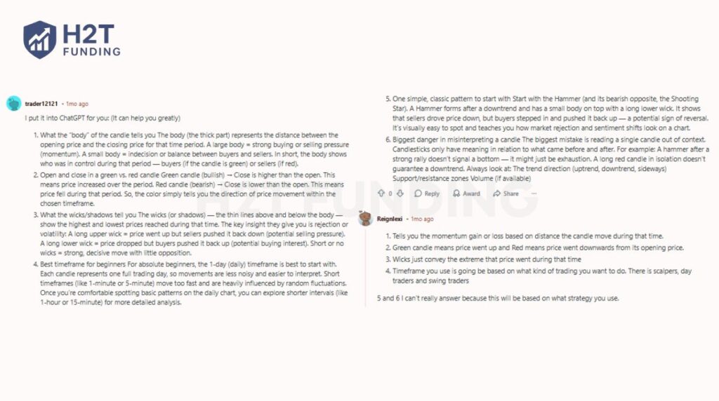
Finally, another trader highlights the biggest danger for new traders: misinterpreting a single candle out of context. A single candlestick is not a trend, and a pattern’s meaning changes completely depending on where it appears.
The message from these traders is clear. Do not treat patterns as a magic formula. Use them as a tool and always combine them with trend, key levels, and volume for a complete analysis.
8. Case study: How candlestick patterns work in practice
Understanding candlestick patterns in theory is only the first step. What really matters is how they behave in real market conditions. In this section, you’ll see practical chart examples that show how candlestick patterns work when combined with trend, volume, and confirmation.
8.1. Example 1: Uptrend + Bullish Engulfing + Volume Confirmation -> Long Trade
Situation: On the H1 timeframe, a currency pair is in a clear uptrend, forming higher highs and higher lows. Price pulls back slightly into a previously identified support zone.
Event: As price tests this support, a small bearish candle appears first. Immediately after, a strong Bullish Engulfing candle forms, completely covering the previous candle’s body. At the same time, trading volume increases noticeably compared to recent candles.
Analysis: The Bullish Engulfing pattern shows that buyers have decisively taken control at support. The increase in volume confirms that the buying pressure is real, not just a weak reaction. Because the signal appears in the direction of the main trend, the setup has a higher probability of success.
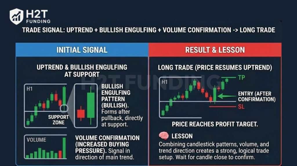
Action: The trader waits for the engulfing candle to close, then enters a Long position on the next candle. The stop-loss is placed below the support zone, and the take-profit is set near the previous high.
Result: Price resumes the uptrend and reaches the profit target. This example highlights how combining candlestick patterns, volume, and trend direction creates a strong and logical trade setup.
8.2. Example 2: Extended uptrend + Evening star at resistance -> Short signal / exit
Situation: On the daily chart, the price has been trending upward for several weeks and is now approaching a major resistance level formed in the past.
Event: At resistance, a three-candle structure appears:
- A strong bullish candle
- A small-bodied candle showing hesitation
- A strong bearish candle closing deep into the first candle’s body
Together, these candles form an Evening Star pattern.
Analysis: The Evening Star signals a shift in control from buyers to sellers. The pattern forms after a long uptrend and directly at resistance, which significantly increases its importance. This is an early warning sign of a potential reversal or at least a deep correction.
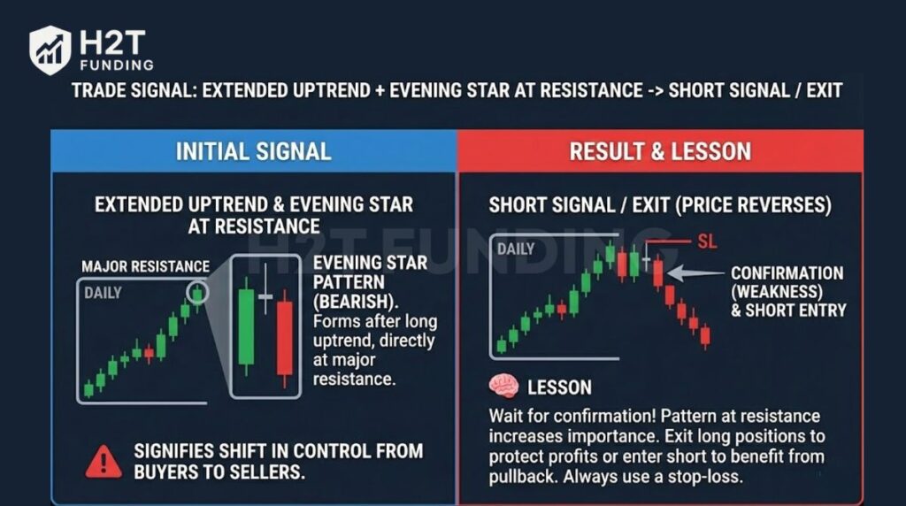
Action: Instead of selling immediately, the trader waits for confirmation. Once the next candle confirms weakness, the trader either closes existing Long positions or enters a Short trade. The stop-loss is placed above the high of the Evening Star formation.
Result: Price fails to make a new high and begins to decline. Traders who exited early protected their profits, while confirmed Short entries benefited from the pullback.
8.3. Example 3: Good-looking candle without volume or timeframe support -> False signal
Situation: A beginner trader spots a bullish-looking candlestick pattern on the 5-minute chart after a short pullback.
Event: The candle has a large body and closes strongly higher. However, volume is low, and the signal goes against the dominant downtrend visible on the H1 and H4 timeframes.
Analysis: Although the candle looks attractive, it lacks key confirmation. There is no volume support, no major support level nearby, and the signal contradicts the higher-timeframe trend. This significantly lowers the probability of success.
Action: The trader enters a Long position immediately, without waiting for confirmation.
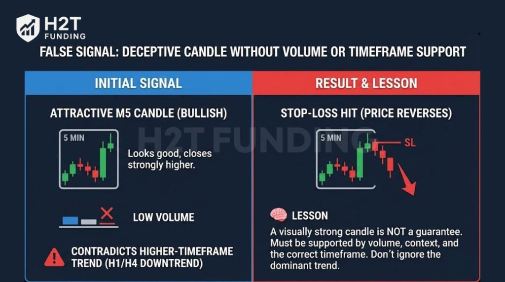
Result & Lesson: Price quickly reverses and continues lower, hitting the stop-loss. The key lesson is that a visually strong candlestick does not guarantee a good trade. Candlestick patterns only work well when supported by volume, context, and the correct timeframe.
These examples show that candlestick charts do not predict the market with certainty. They help traders read probability and market psychology. When candlestick signals align with trend direction, key levels, volume, and confirmation, they can offer high-quality setups.
9. Frequently asked questions (FAQ)
Multi-candle patterns like the Bullish and Bearish Engulfing, or the Morning and Evening Star, are often considered more reliable than single candle signals. However, their true reliability comes from where they appear. Any pattern at a major support or resistance level is more trustworthy.
When learning how to read candlestick charts fast for day trading, this is the standard. It provides the most visual information about price action in a short amount of time, which is essential for making quick decisions. The color-coded bodies instantly show bullish or bearish momentum.
Both charts show the same four data price points: open, high, low, and close. The key difference is the visual presentation. When learning how to read candle bar chart data versus OHLC bars, you’ll find that the colored body of a candlestick makes it much faster to see the relationship between the open and close.
No, it is not. Understanding candlestick patterns is a critical skill, but it is only one piece of the puzzle. Long-term profitability requires combining chart analysis with a solid trading plan, risk management, and strong discipline.
The best way is to start simple. First, understand the four key price points (open, high, low, close). Second, learn what the colors mean. Finally, focus on mastering just a few basic, powerful patterns like the Hammer and the engulfing pattern.
The 3 candle rule is a general guideline that traders use to confirm a market signal. One common interpretation is to wait for three consecutive bearish candles to confirm a reversal or the start of a new downtrend. It is a way of ensuring a move has real momentum behind it.
No. An AI like ChatGPT can describe what a candlestick pattern is from its training data. However, it cannot analyze a live, real-time chart with the necessary context of trend, volume, and key levels to make a valid trading decision.
No single candlestick is a guaranteed buy or sell signal. A bullish pattern like a Hammer suggests a potential buying opportunity. A bearish pattern like a Shooting Star suggests a potential selling opportunity. They always require confirmation and context from the overall chart.
10. Conclusion
Mastering how to read candlestick charts is the foundational skill that separates informed traders from gamblers. You have learned to see beyond simple red and green bars and to understand the story of the battle between buyers and sellers. This guide has given you the alphabet; now it is time to start forming words and sentences.
Remember, a pattern is just one part of a complete trading plan. The next step is to integrate these signals into a robust system. I highly encourage you to continue your education by exploring our detailed guides on building effective trading plans.
To learn more, check out our articles in the Prop Firm Trading Strategies sections at H2T Funding. There, you will find advanced techniques to help you apply what you have learned today and take your trading to the next level.