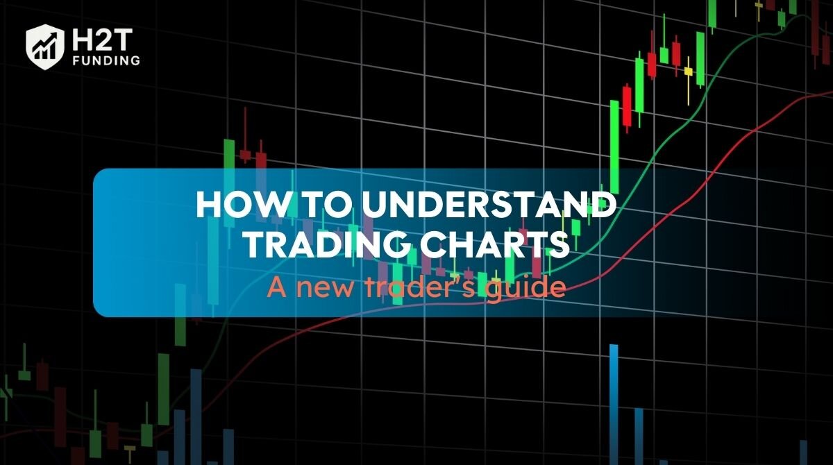
Let’s be honest, the first time you look at a trading chart, it probably looks like a confusing mess of lines, colors, and strange shapes. It’s a common feeling. But every chart is telling a story of the power struggle between those buying and those selling.
Learning to read that story is the single most important skill you can develop as a trader. This guide will demystify it for you. H2T Funding won’t use complicated jargon. Instead, we’ll walk through everything step-by-step, so you can start to how to understand trading charts with clarity and confidence.
Key takeaways:
- Master core chart elements: Understand candlesticks, trends, support/resistance, volume, and timeframes as the market’s language.
- Follow a structured analysis: Use a 5-step approach to identify chart type, timeframe, trend, volume, and support/resistance for effective reading.
- Know chart types and uses: Recognize line, bar, and candlestick charts, plus advanced options, to choose the right visual for your analysis.
- Identify the market’s main direction: Always determine if the market is in an uptrend, downtrend, or sideways consolidation.
- Understand charts’ crucial role: Reading charts is the fundamental skill for objective, evidence-based trading decisions, not emotional ones.
1. Learning some key elements of a trading chart
Before you can interpret the market’s story, you need to learn its alphabet. A trading chart is built from several key elements, and understanding each one’s role is crucial.
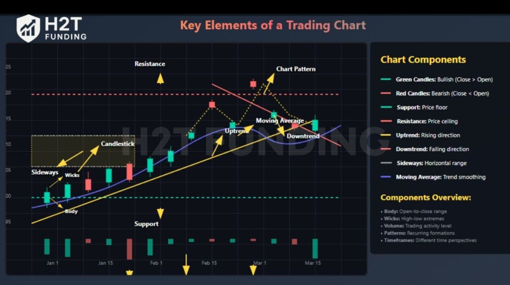
1.1. Candlestick charts: The story of each session
This is the most popular way to view price because each candle is a miniature drama.
- The Body: Think of this as the main event. The main body of the candle visually represents the outcome of the tug-of-war between the session’s open and close prices. A green body means buyers won that round; a red body means sellers dominated.
- The Wicks (or Shadows): These thin lines show the drama’s extremes. They represent the highest and lowest points the price traveled to during the session before settling at the close. Long wicks often signal uncertainty.
1.2. Trends: The overall narrative
Before you look at any single candle, you must understand the overall narrative. Essentially, a trend defines the prevailing directional bias of the market.
- It can be an Uptrend (a bullish story), where the flow of price is generally from the bottom-left to the top-right.
- It can be a Downtrend (a bearish story), a cascade of lower prices from the top-left to the bottom-right.
- Or it can be Sideways (a neutral story), where the market is in a holding pattern, going nowhere fast while it decides on its next move.
1.3. Support and resistance: The market’s memory
These are not just lines; they are psychological battlegrounds where significant market decisions have been made in the past.
- Support: This is a price “floor.” It’s a zone where buyers have historically shown up in force, believing the price is cheap, thus preventing it from falling further.
- Resistance: This is a price “ceiling.” It’s an area where sellers have historically taken control, thinking the price is expensive, which stops it from rising higher.
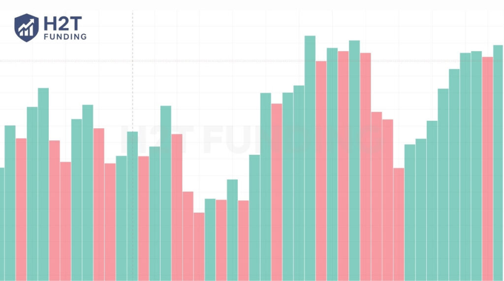
1.4. Volume: The fuel behind the move
Consider volume to be the amount of conviction or force propelling any given price change. In many ways, volume serves to validate the truthfulness of a price move.
- High volume shows strong participation and belief in a price move, making it more credible. A price breakout that occurs with a surge in volume is a significant and powerful market event.
- Low volume signals weak interest or hesitation. A price move on low volume is often suspicious and less likely to be sustained.
1.5. Timeframes: Choosing your magnification
A chart isn’t just one picture; it’s a collection of pictures taken at different intervals. The timeframe you choose is like selecting the magnification on your lens.
- Day traders need a microscope to see short-term action, so they use timeframes like the 1-minute or 5-minute chart.
- Long-term investors need a telescope to see the big picture, so they focus on the daily, weekly, or monthly chart. Your strategy dictates your timeframe.
1.6. Moving averages: Cutting through the noise
On a short-term basis, the flow of price can seem erratic and noisy. A moving average is a simple tool designed to cut through that noise. It calculates the average price over a set number of periods, creating a single, smooth line whose main job is to make the underlying trend easier to spot at a glance.
1.7. Chart patterns: History’s footprints
As you spend more time looking at charts, you’ll inevitably start to notice that history often rhymes. Chart patterns are recognizable formations like triangles, flags, or the famous “head and shoulders.”
Understanding these patterns is a key component of what is a trading plan you can rely on. They are visual representations of the recurring psychological battles between buyers and sellers, and can offer incredibly valuable clues about what might happen next.
2. How to understand trading charts: A step-by-step guide
Now that you’re familiar with the key components of a trading chart, let’s walk through a structured way to analyze one. This method is designed to help you build confidence in reading charts effectively.
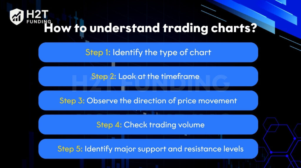
2.1. Step 1: Identify the type of chart
This is a crucial first step in understanding charts for trading. Before you dive into analyzing price movements, first figure out what type of chart you’re looking at. Is it a line chart, a bar chart, or a candlestick chart? Each type shows price data differently, so knowing this will shape how you interpret the information. Most traders prefer candlestick charts because they offer the most detailed view of price action within a given period.
2.2. Step 2: Look at the timeframe
Charts can display price action over various timeframes, ranging from just one minute to one month or even longer. Your choice of timeframe should align with your trading strategy:
- Short timeframes (like 1-minute or 5-minute charts) are ideal if you’re into scalping or day trading, where you make quick, short-term trades.
- Medium timeframes (like 1-hour or 4-hour charts) suit swing traders who hold positions for a few hours to a few days.
- Long timeframes (such as daily or weekly charts) are perfect for position traders and investors who focus on long-term trends.
Picking the right timeframe ensures your analysis matches your trading goals.
2.3. Step 3: Observe the direction of price movement
Next, look at the chart’s overall trend. Is the price generally moving up, down, or sideways? It is an important step to learn how to read trading charts.
- An uptrend (or bullish market) is characterized by higher highs and higher lows, indicating that buyers are in control and the price is rising.
- A downtrend (or bearish market) shows lower highs and lower lows, signaling that sellers are dominant and the price is falling.
- Sideways movement (or consolidation) means the price is staying within a defined range, often suggesting market indecision before a new trend emerges.
Read more:
2.4. Step 4: Check trading volume
Below your main price chart, you’ll usually see volume bars. These bars indicate the amount of trading activity during a specific period and can confirm the strength of a price move:
- Increasing volume when prices are moving up or down often confirms the strength of that move. It means more participants are behind the trend.
- Decreasing volume might suggest that a trend is weakening or that there’s less conviction behind the current price action.
2.5. Step 5: Identify major support and resistance levels
Support and resistance levels are crucial price areas where the market tends to reverse or consolidate. Think of them as invisible boundaries:
- Support is a price level where buying interest is strong enough to prevent the price from falling further. Prices often bounce up from support.
- Resistance is a price level where selling pressure is strong enough to prevent the price from rising higher. Prices often pull back down from resistance.
You can spot these levels by looking at historical price reactions, where the price has frequently paused, reversed, or struggled to break through in the past.
By consistently following these five steps, you’ll build a solid foundation for interpreting charts and making more informed trading decisions. What’s one specific chart component you’re most excited to explore further?
3. How to read a TradingView chart?
Learning how to read a TradingView chart feels like gaining a superpower; suddenly, those confusing lines start telling a clear story! It’s a fantastic platform for beginners because it’s so intuitive, letting you practice what you’ve learned about how to understand charts for trading without feeling overwhelmed.
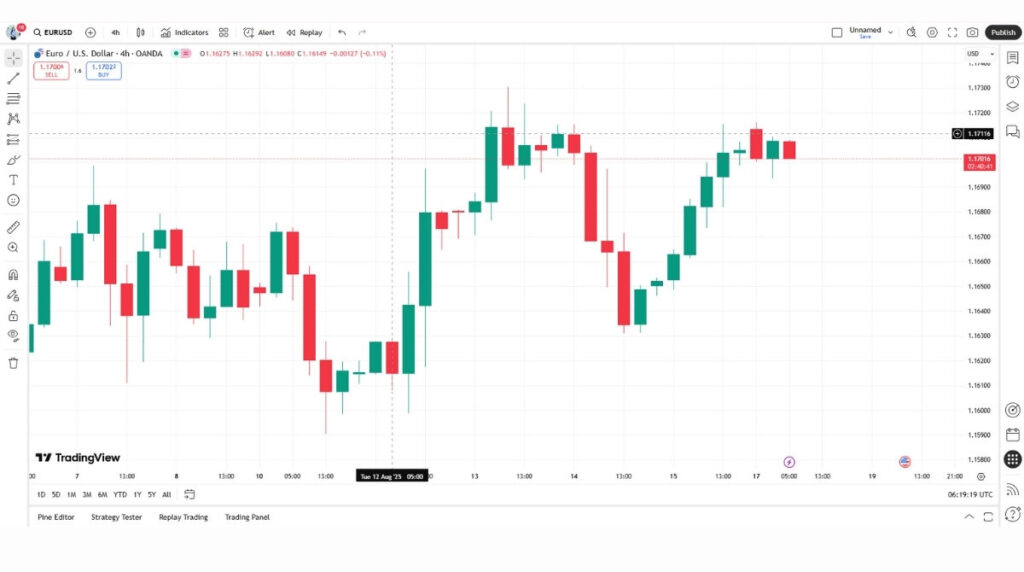
Here’s a quick tour of what you’ll see and how it helps you:
- The main action area: This is where the magic happens! You’ll see the price moving, usually represented by those awesome candlesticks we talked about. This is your primary focus.
- Timeframe & chart type selectors (top bar): Ever wonder if you’re seeing the big picture or just a tiny moment? This is where you switch timeframes (like from “1m” to “1D”) and choose your chart type (always pick Candles for the most info!).
- Symbol Search (top left): Just type in what you want to explore, “AAPL” for Apple, “BTCUSD” for Bitcoin, and TradingView pulls it right up.
- Drawing tools (left toolbar): This is where you become an artist! Draw trendlines to spot directions, or mark support and resistance levels with horizontal lines. Don’t worry about using every tool at first; just try the basics. It’s incredibly satisfying to see your lines match the market’s behavior!
- Indicators (top bar, “Fx” icon): Ready for some extra insights? Here’s where you can add things like Moving Averages or RSI. Think of them as helpful sidekicks, but remember, price action and volume are your main heroes when starting out.
- Volume (bottom panel): Always check this out! It shows you how much “oomph” is behind each price move. High volume means lots of people are in on the action, which makes a move more convincing.
TradingView makes practicing a joy. Seriously, the more you play around, draw on charts, and watch how prices react, the faster you’ll master how to learn to read trading charts. It’s an empowering journey, and TradingView is definitely a friendly guide!
4. The different types of charts: A detailed tour
Each chart type offers a different angle for viewing market activity. Each one offers a unique perspective, and knowing which lens to use for the right situation is a skill in itself.
4.1. Three basic charts
These are the workhorses of the trading world. 99% of your time will be spent using one of these.
4.1.1. The line chart: The big picture
A line chart is the essence of simplicity. It takes only one piece of data, the closing price and connects the dots over a period.
- How it works: It ignores all the intraday drama (the highs and lows) and just shows you where the price settled at the end of each period.
- Pros: Its main purpose is to show the overarching trend without the distraction of daily price swings. Think of it like looking at a mountain range from a distance; you see the overall shape, not every single tree. It’s great for presentations or identifying major, multi-year trends.
- Cons: It lacks the detail needed for making short-term trading decisions.
4.1.2. The bar chart (OHLC): The skeleton
The bar chart is a step up, providing the “skeleton” of what happened in a trading session. Each vertical bar tells a four-part story.
- How it works: Its vertical range is defined by the highest and lowest points reached during the session. A small horizontal tick on the left shows the Open price, and a tick on the right shows the Close price.
- Pros: It gives you a clear sense of the period’s volatility (the height of the bar) and the battle between the open and close.
- Cons: It’s data-rich but can look cluttered and is less intuitive to read at a glance compared to its more colorful cousin.
4.1.3. The candlestick chart: The full story
This is the favorite of most traders for a reason. Candlesticks pack all the data of a bar chart into a much more visual, intuitive format. Each candle is a mini-story.
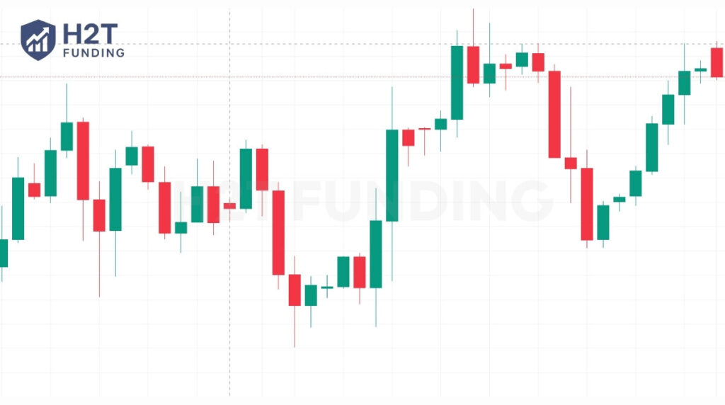
- How it works: It has a “body” (the thick part) and “wicks” (the thin lines). The thick ‘body’ captures the journey from the opening to the closing price, while the thin ‘wicks’ mark the highest and lowest points reached during that session. Crucially, the color of the body tells you who won the battle: a green body means buyers won (price closed higher than it opened), and a red body means sellers won.
- Pros: The visual nature of candles makes it incredibly easy to see market psychology. A long, solid green candle is a clear signal of bullish dominance. When a candle has a very small body but long wicks on both ends, it signals a period of intense struggle with no clear winner.
- Cons: Honestly, for most traders, there are very few. It’s the most balanced and informative chart type.
4.2. Three advanced charts
These are specialized tools. You don’t need them to start, but it’s good to know they exist.
4.2.1. Heikin-Ashi: The trend smoother
Tired of seeing choppy price action with alternating red and green candles that make you second-guess a trend? Heikin-Ashi is the answer.
- How it works: It uses a complex formula to average the price, creating modified candles that smooth out the noise.
- Pros: It excels at making trends visually obvious. In a strong uptrend, you will see a long, unbroken series of green candles, making it easier to stay in a winning trade.
- Cons: It’s important to remember that Heikin-Ashi displays a calculated, averaged price, not the exact real-time market price. It’s an average, so you can’t use it for precise trade entries.
4.2.2. Renko: The noise-canceling chart
This unique chart completely ignores time and focuses only on price movement.
- How it works: You define a “brick” size (e.g., $1). A new “brick” is formed on the chart only after the price has traveled a predefined distance. It could take five minutes or five hours to form one brick.
- Pros: It is fantastic for filtering out insignificant price action and making support and resistance levels incredibly clear and clean.
- Cons: You lose all sense of time and momentum within a price move.
4.2.3. Tick and volume charts: The activity meters
These charts also ignore time but are based on market activity.
- How it works: A Tick Chart creates a new bar after a set number of transactions (e.g., every 1,000 trades). A Volume Chart creates a new bar after a set number of shares have been traded (e.g., every 100,000 shares).
- Pros: They give you a high-definition view of the market when activity is high and slow things down when the market is quiet. These are considered specialized instruments primarily used by intraday traders who want to analyze the flow of trades.
- Cons: They can be complex and are generally not recommended for beginners.
5. Understanding the three main market trends
The market can only move in three directions. Your first job as a chart reader is to identify which one is currently in play.
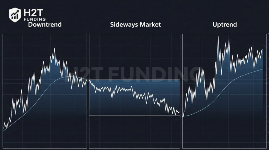
5.1. The uptrend (a bullish market)
You’ll spot an uptrend when the chart consistently prints new peaks, with each trough being higher than the last. This is a clear sign that buyers are in control and are willing to pay higher prices over time.
5.2. The downtrend (a bearish market)
A downtrend is the opposite. It’s a series of descending peaks and troughs, showing that sellers have the upper hand and are pushing the price lower.
5.3. The sideways market (consolidation)
This happens when the price gets stuck trading within a horizontal “box.” It signals a period of balance or indecision between buyers and sellers. Often, a sideways market is like a coiled spring, building up energy for a large move up or down.
6. The importance of understanding trading charts
In today’s markets, trading on a whim or a hot tip isn’t just risky; it’s a recipe for disaster. Trust me, I’ve seen it play out too many times. Learning to read charts isn’t just about technical skills; it’s about grounding your decisions in logic and undeniable evidence, freeing you from the emotional rollercoaster.
- You learn to read the market’s story: Instead of just seeing chaotic lines, you’ll start to discern the market’s true narrative, its momentum, its hesitation, and those crucial potential turning points. It’s like unlocking a secret language that whispers insights.
- You trade based on evidence, not emotion: Charts provide objective, cold-hard data. This empowers you to build a logical plan and, crucially, gives you the strength to stick to it, even when fear or greed tries to creep in.
- It’s the foundation for everything else: Every single advanced trading strategy, without exception, is built on a solid understanding of reading price action. If you’re just dipping your toes in, grasping the basics of the best trading strategy for beginners isn’t just helpful; it’s an absolutely essential first step on your journey.
7. A quick look at technical indicators
Indicators are tools that use mathematical formulas to help you interpret price action. Avoid unnecessary complexity by focusing on the fundamental principles first.
7.1. Trend indicators
Trend indicators are tools that help identify the direction and strength of a price trend in the market. They make it easier for traders to discern whether prices are rising, falling, or moving sideways.
- Moving Averages (MA): An MA’s job is to smooth out the chaotic price action into a single, easy-to-read line, making the underlying trend much clearer.
- MACD: This indicator helps you see changes in the market’s momentum. Is the trend getting stronger or weaker? The MACD can offer clues.
7.2. Oscillators
Oscillators are tools often used to identify overbought or oversold conditions, as well as to measure momentum and the strength of a trend. They typically fluctuate within a defined range.
Relative Strength Index (RSI): Its main purpose is to flag when an asset might be “overbought” (and due for a pullback) or “oversold” (and due for a bounce).
8. Frequently asked questions (FAQ)
Analyze by identifying trends, marking support/resistance, checking volume, and looking for candlestick/chart patterns.
The four essential data points for any period: its opening, highest, lowest, and closing prices.
Understand the chart type and timeframe, then identify the trend, support/resistance, and confirm with volume.
For beginners, focus on candlestick charts. Identify the main trend, spot support/resistance, and observe volume. Practice consistently.
You can’t predict with certainty. Use technical analysis to find probabilities and potential scenarios based on past data.
Look at the title, axis labels, and then follow the data to understand what’s being shown.
State purpose, describe axes, explain data, highlight trends, and summarize conclusions.
Common rules involve identifying shifts, trends, unusual runs, and outlier points.
8. Conclusion
Remember, this isn’t a race. Learning how to understand trading charts is a skill built over time, through practice and patience. While theory is your foundation, practical application is where the real learning happens.
The theory you’ve learned here is your foundation. Now, it’s time to build on it. Open a demo account and start applying this five-step process. Watch the markets, identify the patterns, and build your confidence without risking a single dollar. This is how real traders are made.
For more useful information Strategies: Prop Firm & Trading Strategies, including insights on how to choose a prop firm, follow H2T Funding.