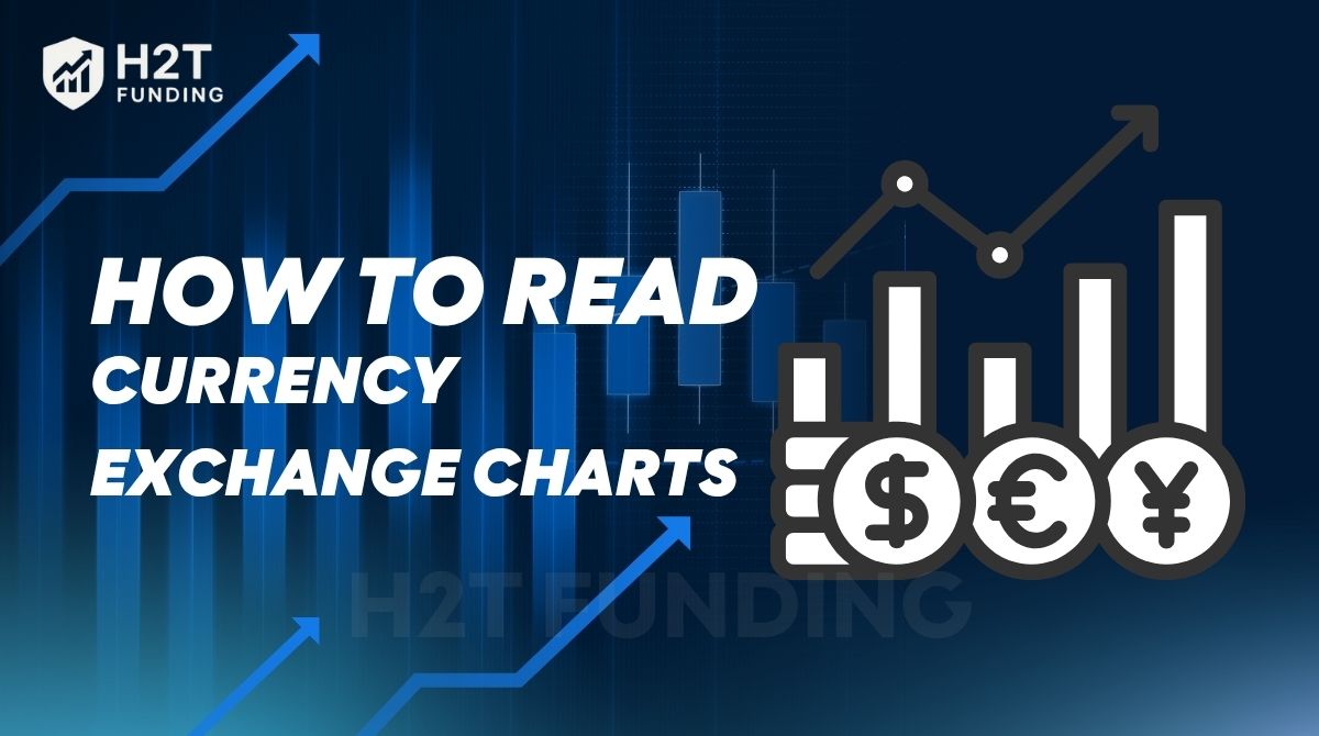
Opened a forex platform for the first time and felt lost in a sea of candles, lines, and endless numbers? That’s a feeling almost everyone shares. But trust H2T Funding, learning how to read currency exchange charts is the key that turns that chaos into a clear market story.
Once you decode the visual representation of price data, spotting market trends, pinpointing entry points, and managing risk become second nature. Start your learning journey today, explore our free beginner’s guides, and take your first confident step into the forex market.
Key takeaways
- Currency exchange charts show price movement over time, helping traders see trends, volatility, and trading activity.
- The three main types are line charts, bar charts, and candlestick charts, each with unique strengths for visual aid.
- Understanding open price, close price, high, and low levels is crucial to reading forex trading charts effectively.
- Reading charts lets you identify support, resistance, and patterns that guide trading decisions.
- Practicing with demo accounts builds confidence and improves chart-reading speed.
1. What are currency exchange charts?
Currency exchange charts are a living visual representation of price behavior in the forex market, showing how a currency pair’s value has moved over time. Instead of pure guesswork, they allow traders to see the price fluctuations clearly and form the absolute basis for how to read forex charts in practice.
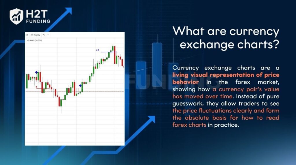
Currency exchange charts are a living visual representation of price behavior in the forex market
Understanding these charts is essential because every trading decision, from spotting supply and demand zones to timing an entry, relies on interpreting price data correctly. Without them, analyzing trading activity or volatility becomes guesswork.
At their core, most charts display three simple elements:
- Price: open price, close price, high, and low of each period.
- Timeframe: the length of time each bar or candle represents, from minutes to months.
- Volume: trading activity that reflects the strength behind price movement.
2. Popular types of currency charts
When learning how to read forex trading charts, it’s important to start with the main chart types traders use every day. Each chart offers a unique visual aid that highlights price data differently. By practicing with these, beginners build confidence to analyze trends and accurately read exchange rate movements.
The most common ones include:
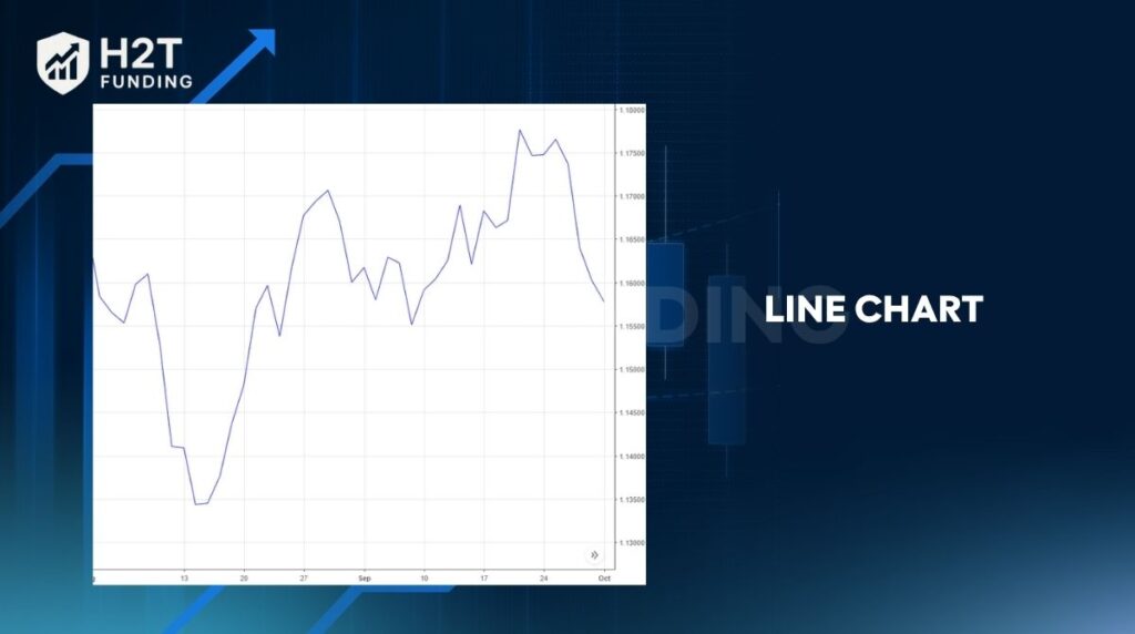
- Line chart: Focuses on closing prices to show the overall direction.
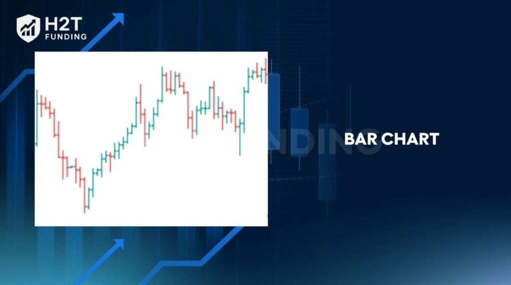
- Bar chart: Reveals open, close, high, and low for each period.
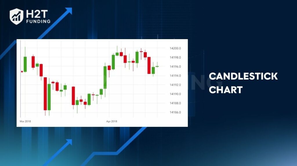
- Candlestick chart: Visualizes price movement through color-coded candles.
- Other chart types, such as Heikin-Ashi or HLOC charts, smooth or emphasize different aspects of price action.
2.1. Line chart
A line chart is the simplest type, connecting closing prices over a chosen timeframe. It gives a clean view of overall price movement without distraction from intraday highs or lows. This chart is ideal for spotting long-term trends quickly.
2.2. Bar chart
A bar chart adds more detail, showing the open price, close price, and price range for each period. Each bar helps traders measure volatility and understand how supply and demand affected the market during that timeframe.
2.3. Candlestick chart
Candlestick charts are the most popular in forex because they show open, close, high, and low in a visually intuitive way. Patterns formed by candles often reveal market psychology, making it easier to anticipate shifts in trading activity.
2.4. Other chart types
Some traders explore alternatives like Heikin-Ashi, which smooths out price fluctuations for clearer trend views, or HLOC charts that emphasize price range. These charts are useful when you want to reduce noise or confirm signals.
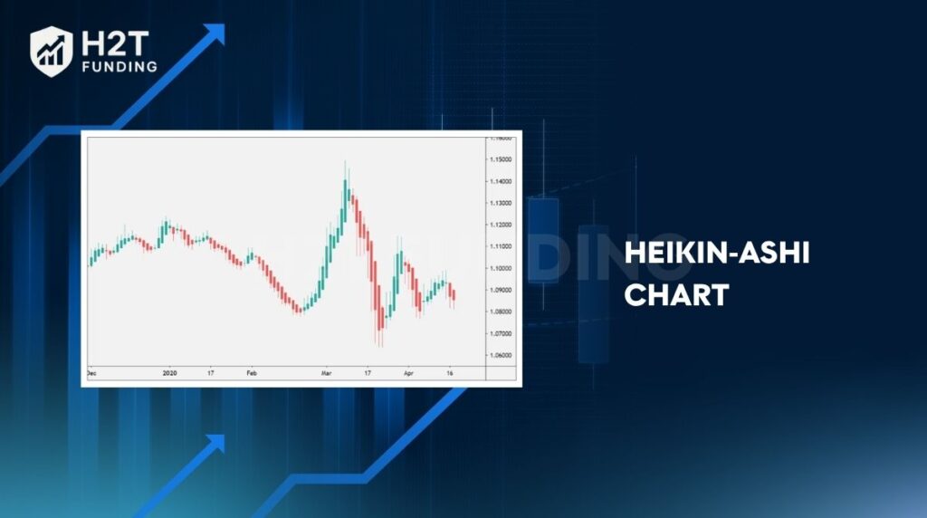
Heikin‑Ashi chart: Heikin-Ashi (Japanese: “average pace/bar”) is a modification of the standard candlestick chart that smooths price action so that trends become easier to identify.
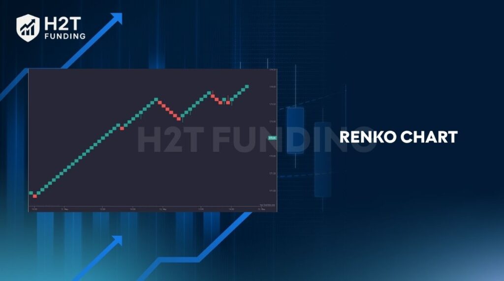
Renko chart: Renko charts are price-movement-based charts (rather than time-based). Blocks (“bricks”) are drawn when the price moves a fixed amount; time intervals don’t matter.
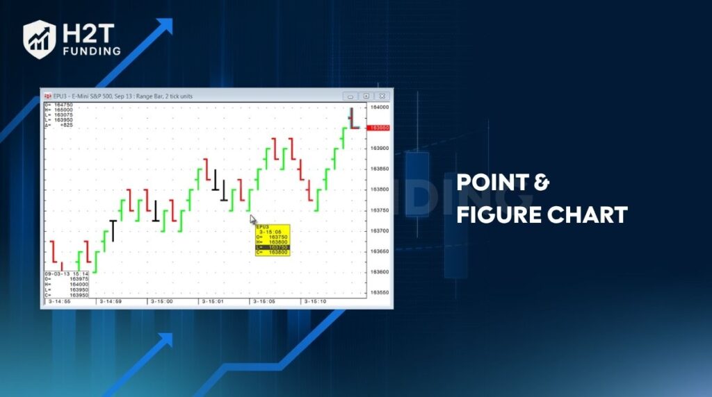
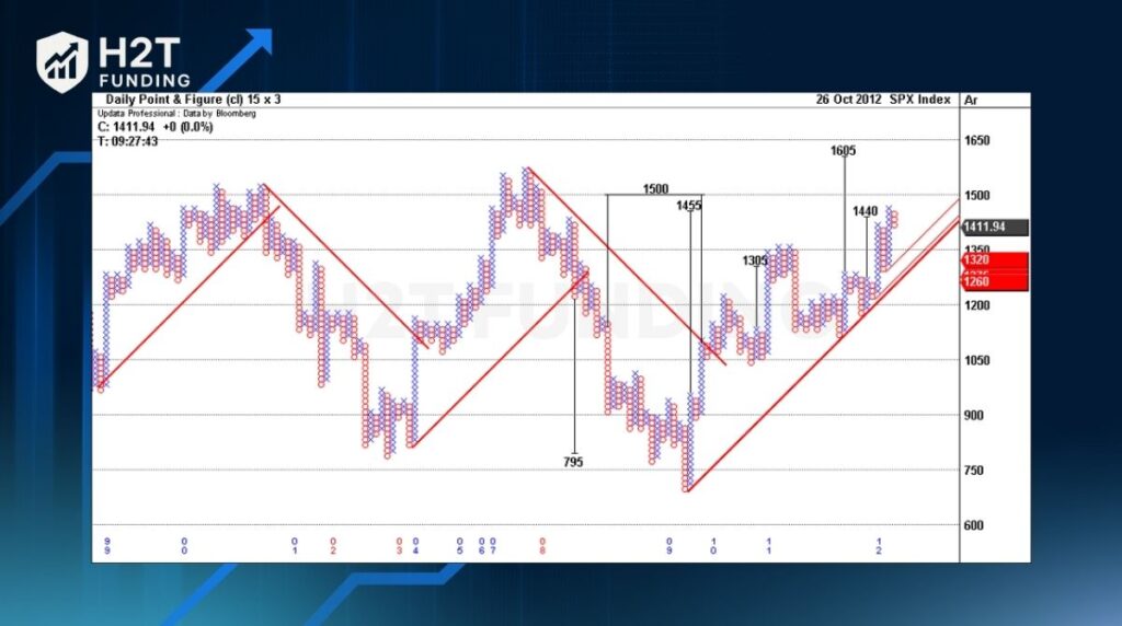
Point & figure chart (P&F): Point & Figure charts are another “non-time” charting format: price movements are plotted in columns of X’s (rising) and O’s (falling) when price moves by a predetermined amount. Time is not considered.
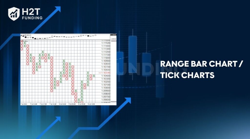
Range bar chart/tick charts: Range bar charts plot new bars when the price moves a specific range (range of pips), regardless of time. Tick charts plot new bars after a certain number of trades (ticks) have occurred. These are less common in mainstream forex, but useful for active traders.
Understanding the main chart types is the foundation for chart reading. Each one provides a different level of detail, and together they give traders a complete toolkit to analyze price behavior and improve decision-making.
3. How to read currency exchange charts
Every forex chart shows price on the vertical axis and time on the horizontal axis. Your task is to interpret how price moves through time to understand market sentiment and manage your positions effectively – a skill that goes hand-in-hand with learning how to calculate lot size in forex for proper risk control.
3.1. Reading line charts
A line chart connects each closing price across time intervals.
- How to read: Follow the slope of the line. An upward slope indicates bullish momentum; a downward one signals bearish sentiment.
- When to use: To identify long-term trends or compare different currency pairs at a glance.
- Tip: Focus on major turning points, peaks, and troughs to reveal where momentum shifts.
3.2. Reading bar charts
A bar chart (OHLC chart) shows four key prices per period:
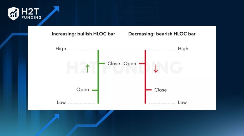
- Open: small horizontal tick on the left.
- Close: small tick on the right.
- High and Low: top and bottom of the bar.
- How to read:
- A longer bar = higher volatility.
- If the close is above the open, buyers dominated (bullish); below, sellers dominated (bearish).
- Use case: Ideal for measuring volatility and short-term price behavior.
3.3. Reading candlestick charts
Candlestick charts combine the data of bar charts with visual clarity.
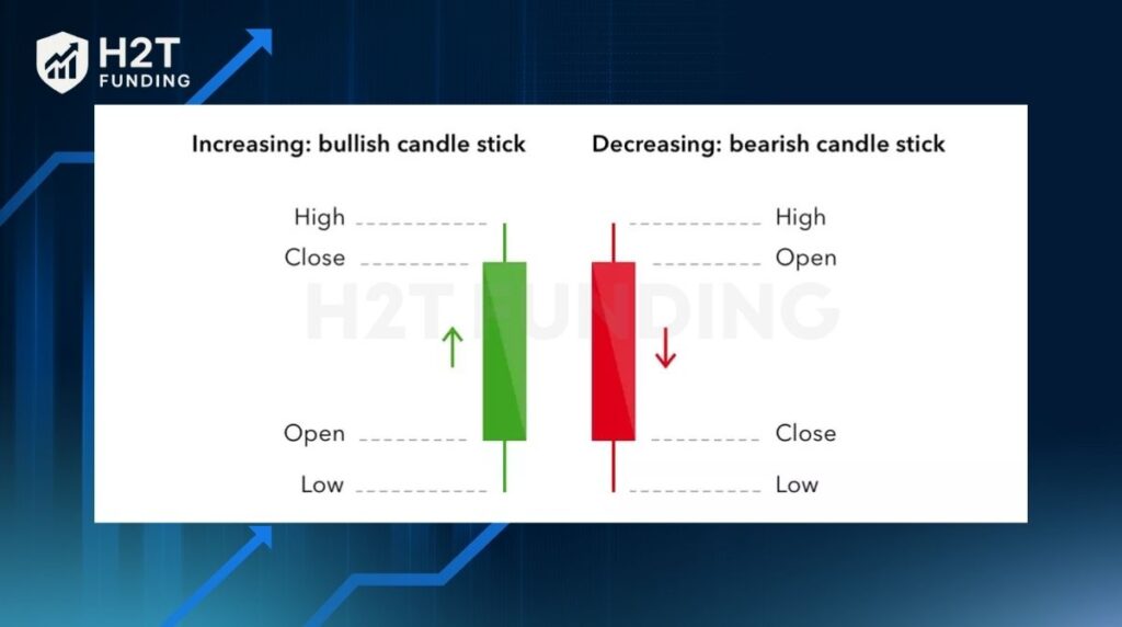
- Body: shows the range between open and close.
- Wicks (shadows): mark high and low points.
- Colors:
- Green/White: close > open → bullish candle.
- Red/Black: close < open → bearish candle.
- How to read:
- Watch for patterns, e.g., Doji (indecision), Hammer (reversal signal), Engulfing (strong trend shift).
- A series of large bullish candles = strong buying pressure.
- Use case: Best for identifying trend strength and reversal signals.
3.4. Reading other chart types
Alternative charts give traders different perspectives on price action:
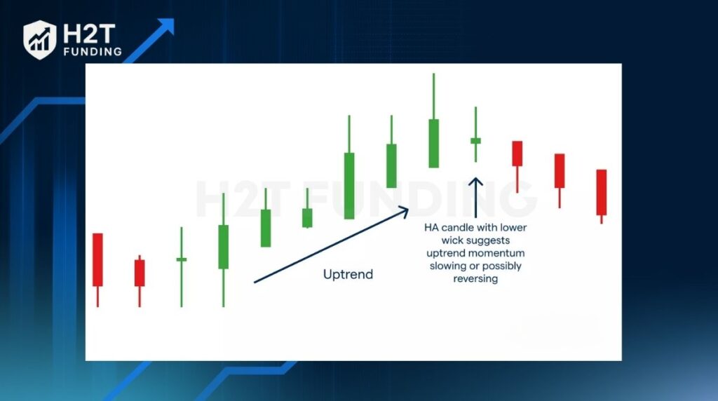
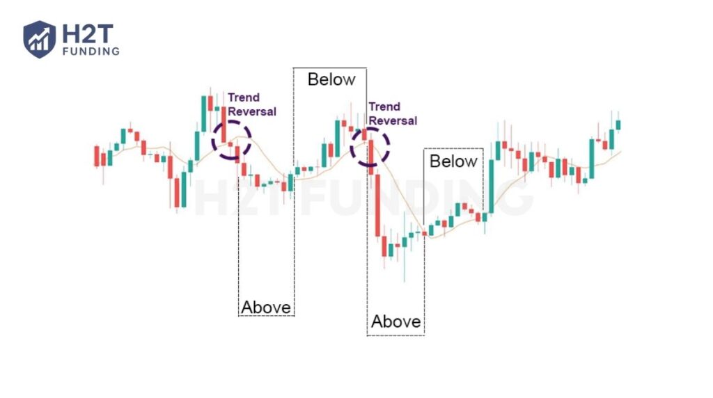
Heikin-Ashi: smooths out noise to highlight ongoing trends. Consecutive green candles with no lower wicks indicate a strong uptrend.
Renko: ignores time, forming “bricks” only when price moves by a set amount. Useful for spotting clean trend reversals.
Point & Figure: plots X’s (price rises) and O’s (price falls) for significant moves, filtering out small fluctuations.
Practical reading tips:
- Always check the timeframe (e.g., 1H, 4H, Daily). Shorter = more noise; longer = broader trend.
- Identify support and resistance by connecting previous highs and lows.
- Combine chart reading with indicators (e.g., moving averages, RSI) to confirm momentum and trend direction.
- Use a demo account to practice without risk before trading live.
Read more:
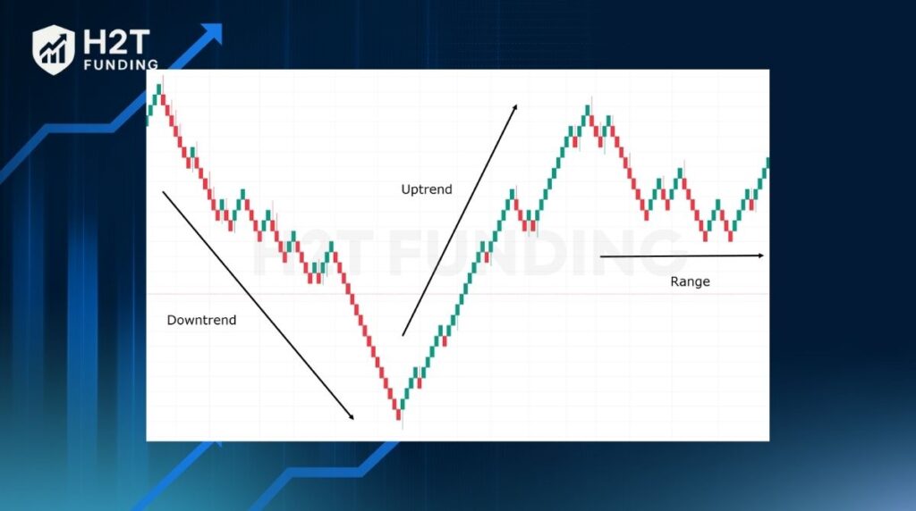
4. Identify trends on currency charts
Spotting a trend is one of the most important skills in chart reading. Trends show whether market participants are mainly buying or selling, giving direction for trading activity. Recognizing these movements helps traders align with the market instead of fighting against it.
Trendline basics:
A trendline is a straight line that connects at least two price points on the chart.
- Uptrend: drawn by linking higher lows, showing buyers in control.
- Downtrend: drawn by linking lower highs, showing sellers in control.
- Sideways trend: price fluctuates within a range, with no clear direction.
Trendlines act as a visual representation of momentum and give traders a framework for technical analysis.
Support and resistance:
- Support: a level where falling prices repeatedly stop and bounce back, showing strong demand.
- Resistance: a level where rising prices often stall and reverse, showing strong supply.
These levels help traders set entry, stop-loss, and take-profit orders with more precision.
5. Using technical analysis to forecast FX prices
Once you understand basic chart reading, the next step is applying technical analysis. This method studies historical price data and chart patterns to anticipate future price direction. Instead of guessing, traders use past behavior as a guide to forecast how supply and demand may unfold.
Common tools include:
Candlestick patterns: signals of potential reversals or continuations.
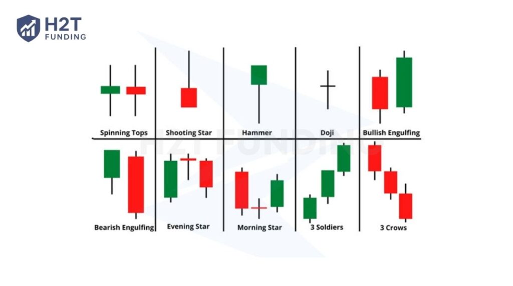
Moving averages: smooth out price fluctuations and highlight long-term trends.
Indicators, such as RSI or MACD, measure momentum and market strength.
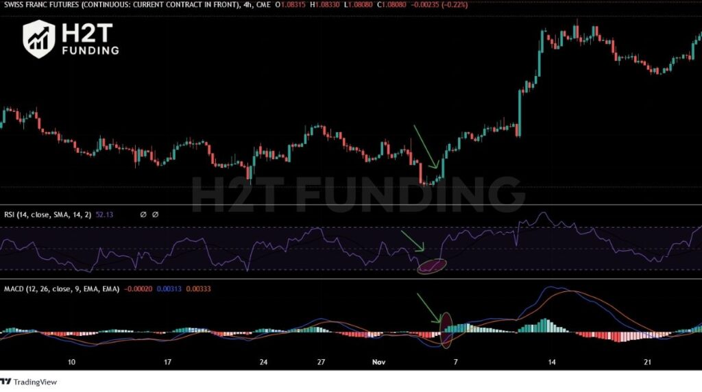
Technical analysis does not guarantee accuracy, but it increases probability by combining price data, trendlines, and chart formations. For example, repeated rejection at resistance paired with a bearish candlestick pattern often warns of a downturn.
Forecasting FX prices with technical analysis turns raw numbers into actionable insights. By blending chart patterns with indicators, traders can improve timing and manage risk more effectively.
6. Common patterns on exchange rate charts
As you dig into how to read the charts in forex, you’ll quickly notice something fascinating: history tends to repeat itself in the form of patterns.
These aren’t random shapes. These patterns are the footprints of market psychology, capturing price movement and showing how buyers and sellers are battling it out at key levels. Recognizing them is like getting a hint about what might happen next, forecasting potential volatility and breakouts.
6.1. Triangle patterns (Ascending, Descending, Symmetrical)
Triangles form when price fluctuations narrow into converging trendlines.
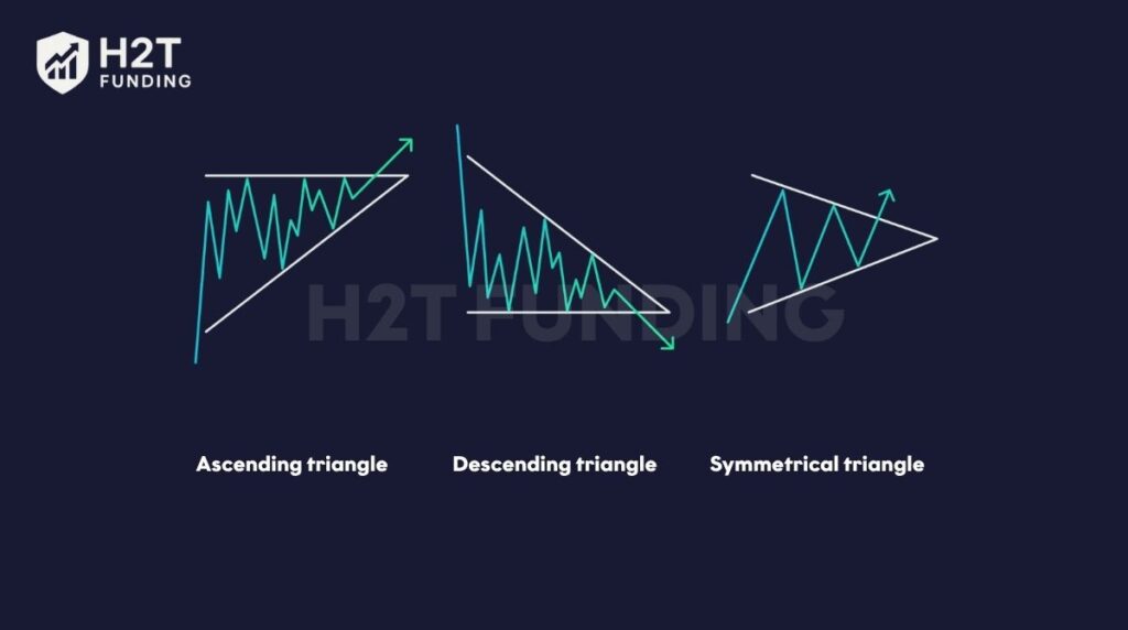
- Ascending: higher lows press against a horizontal resistance, signaling buying pressure.
- Descending: lower highs push toward support, suggesting selling pressure.
- Symmetrical: both highs and lows converge, reflecting balance in supply and demand until a breakout occurs.
6.2. Pennants and flags
Pennants and flags are short-term continuation patterns that appear after sharp price movements.
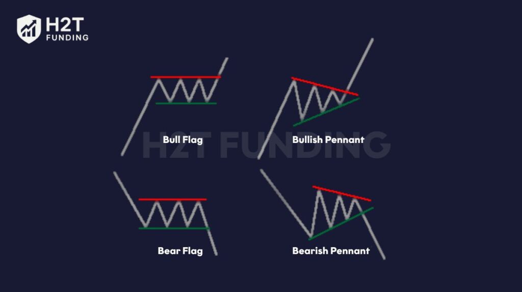
- Flags: small parallel channels sloping against the trend.
- Pennants: tiny symmetrical triangles forming during consolidation. Both act as a pause before trading activity resumes in the same direction.
6.3. Other reversal formations
Reversal patterns signal potential turning points in price behavior. Examples include head-and-shoulders, double tops, and double bottoms. These often show weakening momentum, warning traders that market participants may soon change direction.
Identifying patterns is a vital part of technical analysis. Each formation offers a visual representation of crowd psychology, giving traders a structured way to interpret price behavior and prepare for the next move.
7. Real-life example: How to read the GBP/USD chart
The GBP/USD chart illustrates how traders interpret movements between the British pound (base currency) and the US dollar (quote currency). On the y-axis, you see the exchange rate of how many dollars are needed to buy one pound.
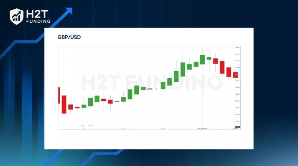
The x-axis represents the timeframe, which can be set from minutes to months depending on trading style. Each candlestick shows the open, close, high, and low, giving a full picture of volatility.
Trend analysis:
In this chart, you can see a clear upward series of green candles, showing strong buying activity. This pattern signals an uptrend, as the market participants consistently push prices higher with each new candle.
Entry and exit points:
Traders may choose to enter when the price pulls back slightly during the trend, using support levels for confirmation. Exits are often set near resistance zones or when candlesticks indicate weakening momentum, such as long wicks or bearish closes.
Risk management:
Placing stop-loss orders below recent lows helps limit potential losses if the trend reverses. Combining position sizing with predefined risk levels ensures that even if the market turns, losses remain controlled.
By combining the visual aid of candlesticks with context, the GBP/USD chart transforms raw numbers into structured insights. Recognizing trends, planning precise entries and exits, and applying risk control help traders trade with greater confidence.
8. Tips for reading charts quickly and effectively
Stumbling a bit when you first start reading charts is perfectly normal. But once you get the hang of how to read currency exchange rates efficiently, you’ll save a ton of time and make decisions with more confidence. The secret isn’t about using complex tools; it’s about simplifying your approach and trusting the clearest signals you can see from the price behavior.
8.1. Focus on candlestick charts
Candlesticks provide more detail than a simple line or mountain chart. Each candle shows market psychology, whether buyers are bullish, sellers are dominant, or the market is stuck in indecision. By practicing candlestick reading, traders quickly recognize shifts in momentum.
8.2. Practice with demo accounts
Using a demo account allows you to test strategies in real market conditions without risking capital. This helps you build confidence, understand price behavior, and refine entries and exits before moving to live trading.
8.3. Keep a trading journal
A trading journal is more than notes; it’s a record of your decisions, reasons, and outcomes. By reviewing trades, you spot patterns in your behavior and adjust accordingly, improving consistency over time.
Extra reminders
- Always check the chosen timeframe before analyzing.
- Avoid rushing; even quick chart reading should follow a clear process.
- Combine chart analysis with risk management to stay disciplined.
Reading charts effectively is about clarity, not complexity. By focusing on candlestick insights, practicing regularly, and reflecting with a journal, traders can streamline their chart analysis and make faster, more accurate decisions.
9. Application of exchange rate charts in analysis and trading
Exchange rate charts are more than visual aids; they are essential tools for planning and executing trades. By combining chart reading with discipline – a key trading skill explored in detail in how to be more disciplined in your trading – traders can make more informed decisions, integrate technical signals, and protect their capital.
9.1. Using charts to make trading decisions
Charts reveal supply and demand dynamics, allowing traders to identify entry and exit levels. For example, spotting a breakout above resistance may trigger a buy, while a reversal candlestick at support could signal a sell. These signals turn raw price data into actionable trade setups.
9.2. Combining charts with basic technical indicators
Charts become more powerful when paired with simple tools like moving averages, RSI, or MACD. Indicators confirm what price action suggests, such as whether momentum supports a breakout or if conditions are overbought. This synergy reduces false signals and improves decision accuracy.
9.3. Managing risk through chart analysis
Risk management is closely tied to chart interpretation. Stop-loss orders are often placed just beyond support or resistance levels, while position sizing depends on volatility and price range. This ensures traders limit downside even when forecasts are wrong.
Applying charts in trading means blending visual interpretation with practical tools and rules. From finding trade opportunities to confirming signals and protecting capital, exchange rate charts remain at the heart of a disciplined trading strategy.
10. FAQs
The line chart is the simplest because it only shows closing prices over time. It helps beginners see overall trends without being distracted by intraday price fluctuations.
Each candlestick displays the open, close, high, and low for a chosen timeframe. A green candle means the close was higher than the open, while a red candle means the opposite.
Candlestick charts are most popular, but line charts are best for absolute beginners. Once you grasp the basics, candlesticks provide more detail about price behavior.
Support is where falling prices repeatedly bounce upward, while resistance is where rising prices often stall. These levels are visible by connecting previous highs or lows.
Start by focusing on price movement across timeframes. Learn to recognize trendlines, support, and resistance before moving to more advanced tools.
On MT4, select a currency pair and choose the chart type (line, bar, or candlestick). You can adjust the timeframe and apply indicators directly to the chart.
Use a demo account to explore different chart types and timeframes. Combine practice with a trading journal to track mistakes and improve accuracy.
Yes. Weekly and monthly charts help investors study broader market cycles, making them useful for spotting long-term opportunities.
No pattern is foolproof. They increase probability but must be combined with risk management and discipline for consistent results.
11. Conclusion
Mastering how to read currency exchange charts is one of the most valuable skills for anyone entering the forex market. From understanding candlesticks and trendlines to applying technical analysis, charts provide the visual representation needed to interpret market psychology and make informed trading decisions.
At H2T Funding, we believe that trading success begins with a solid foundation in chart reading, risk management, and discipline. By practicing consistently and combining chart insights with proven strategies, traders can navigate price fluctuations with more confidence.
Want to expand your knowledge further? Explore more expert guides and resources in our Prop Firm & Trading Strategies category to strengthen both your technical skills and trading mindset.